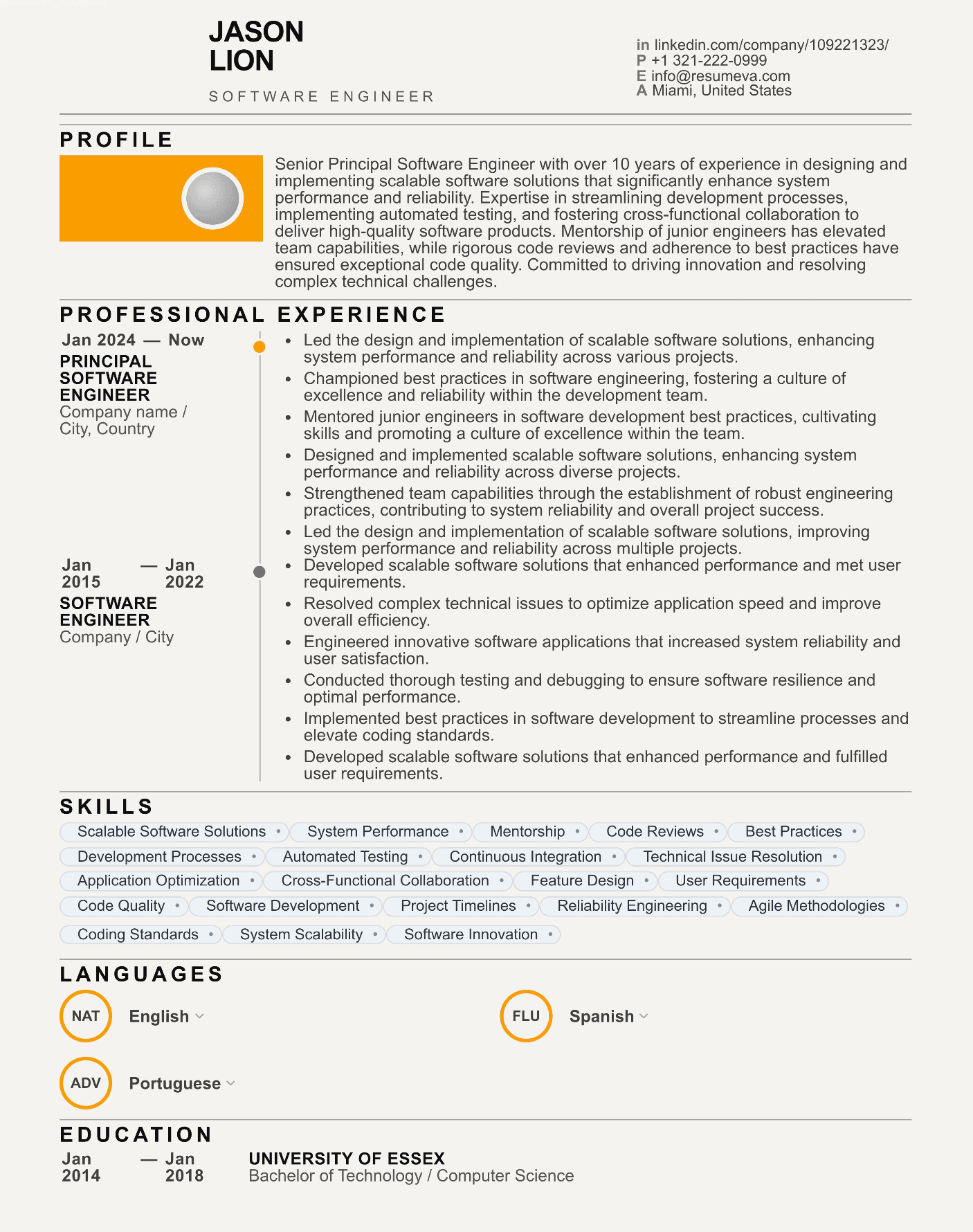
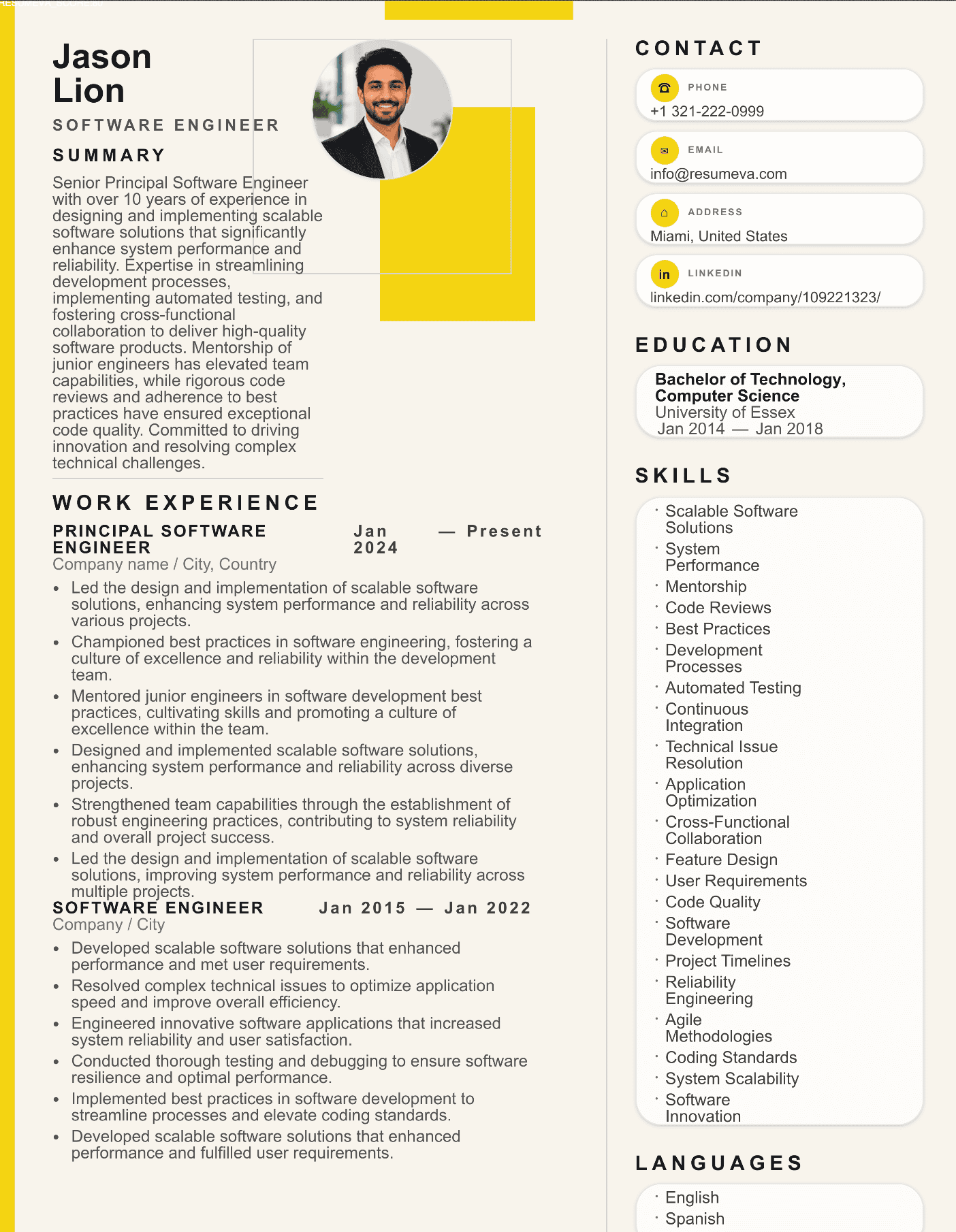
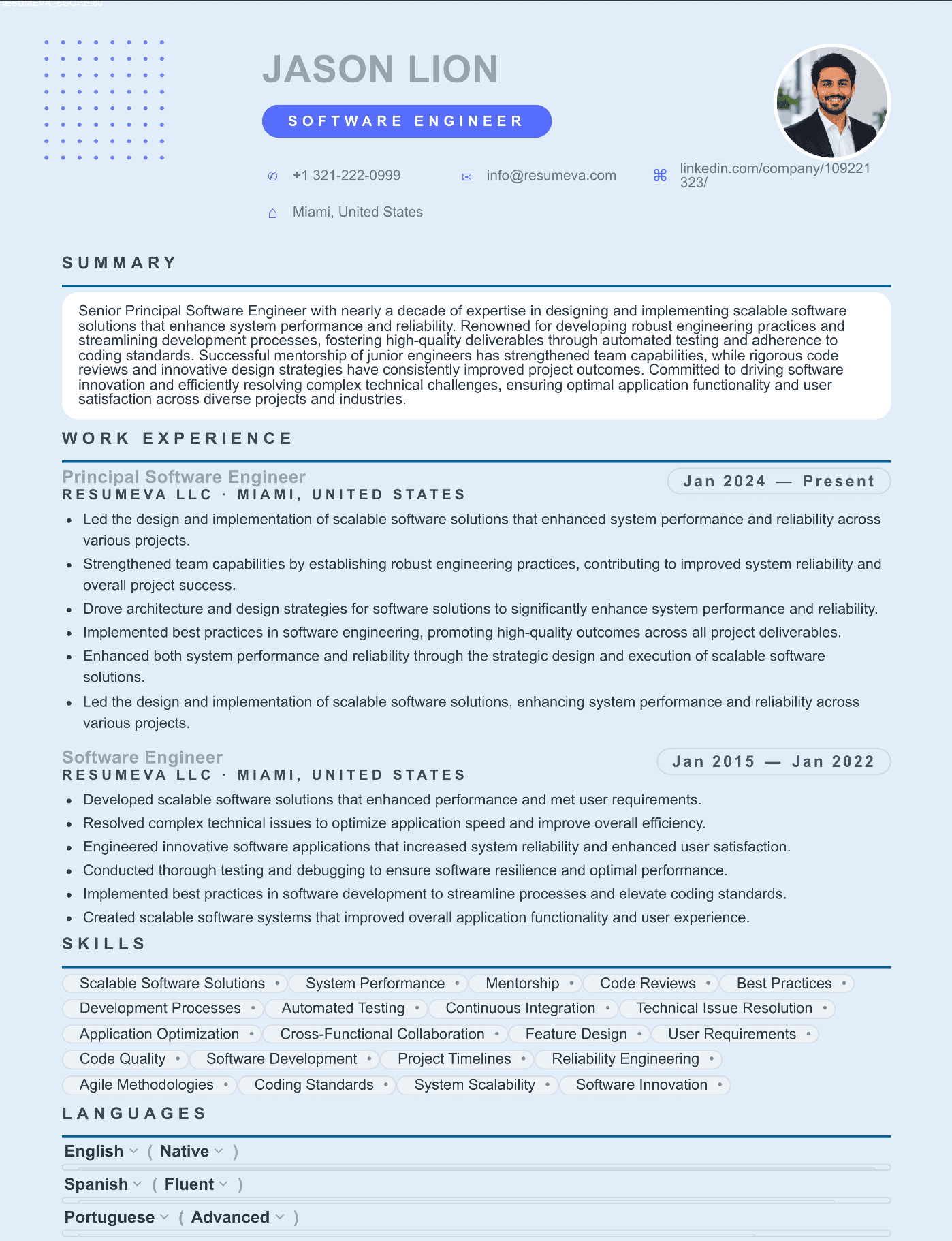
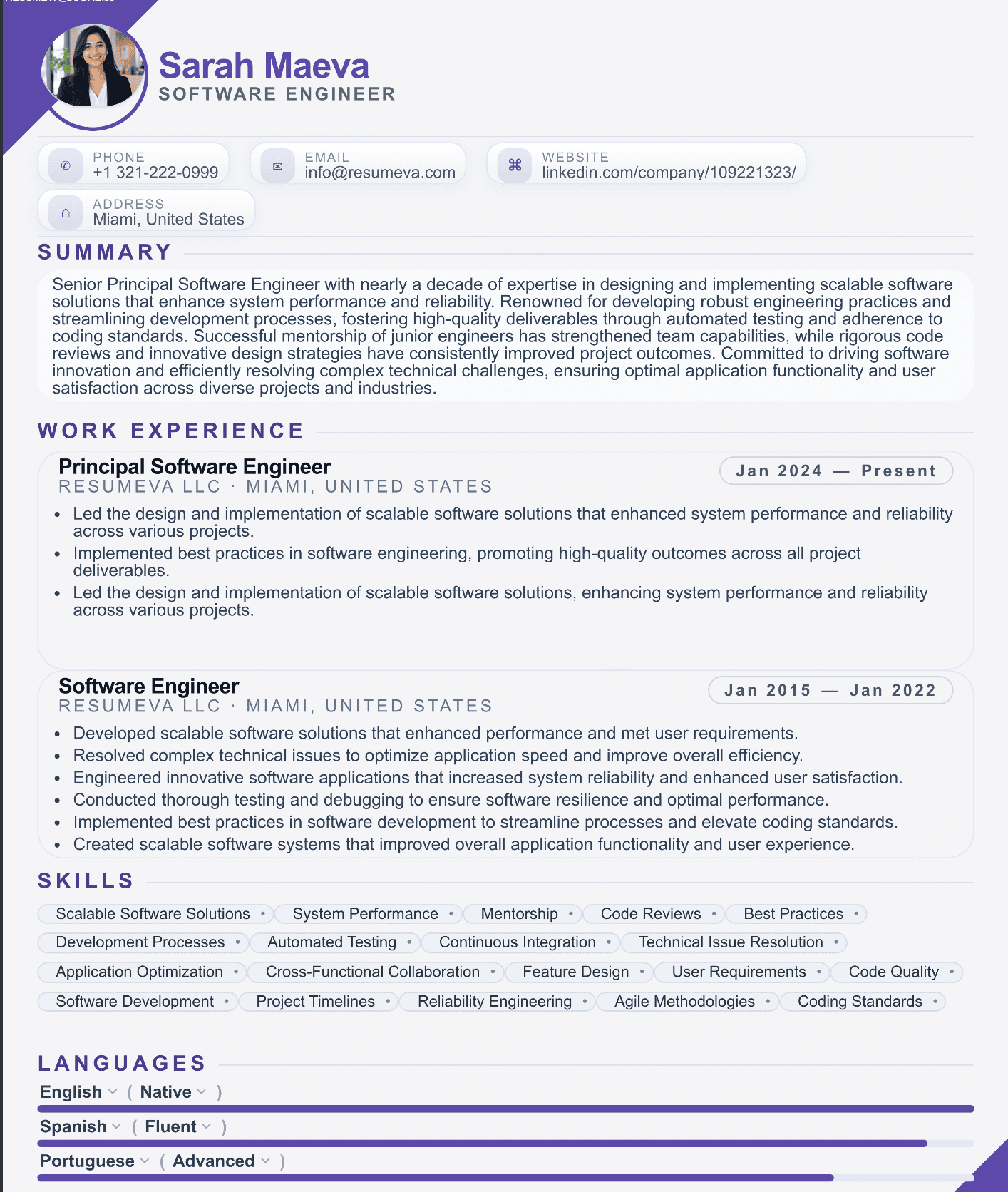
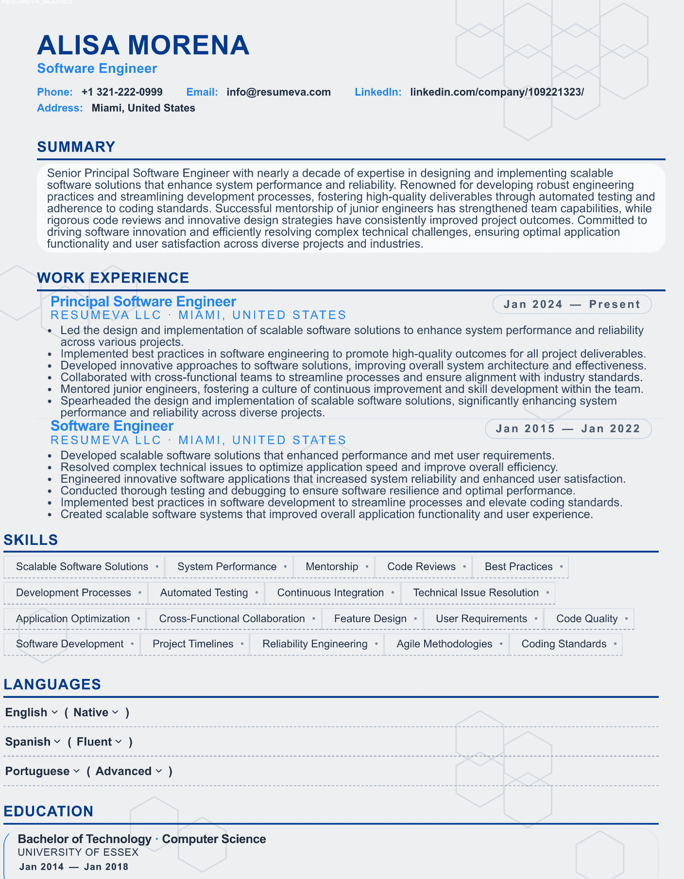
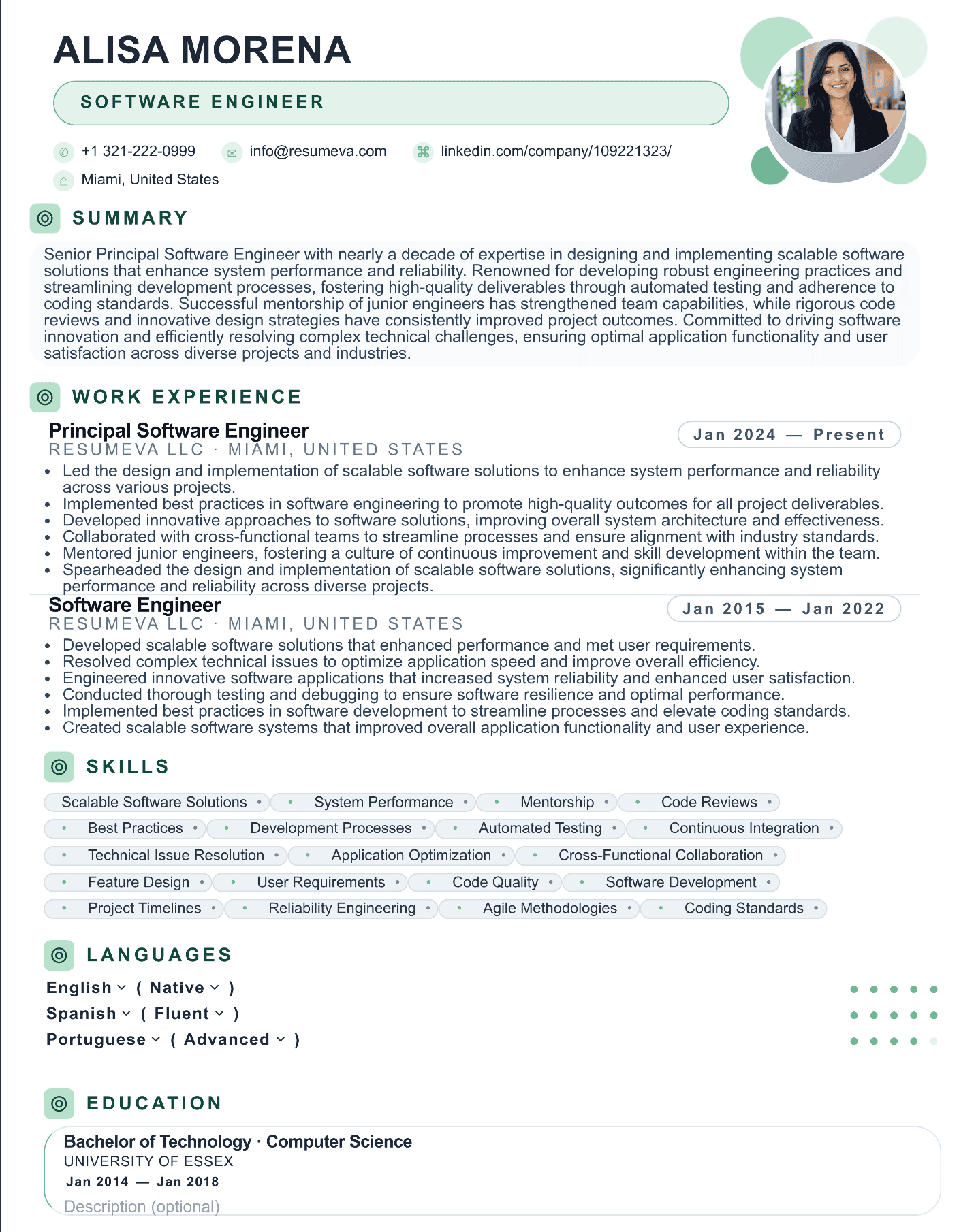
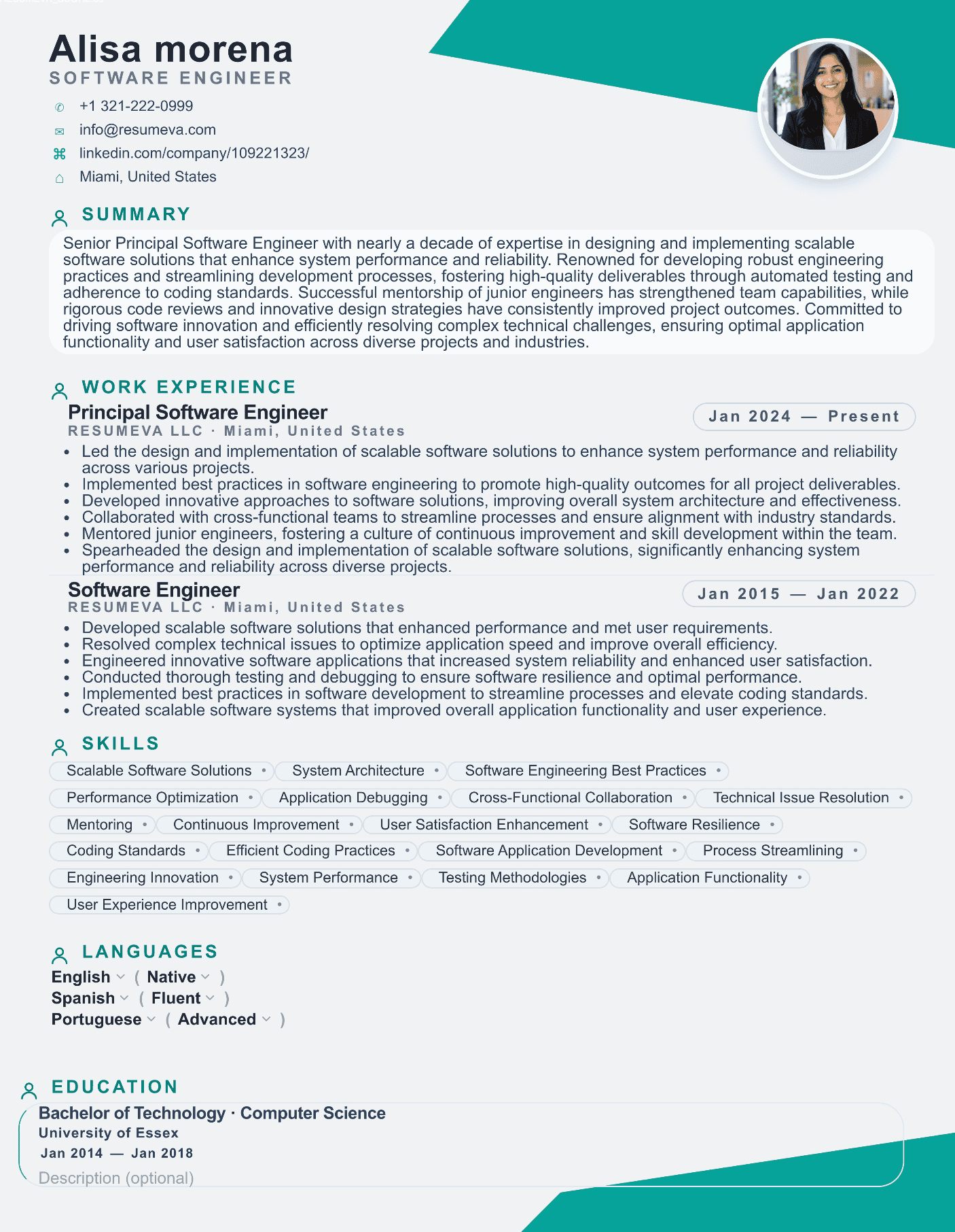
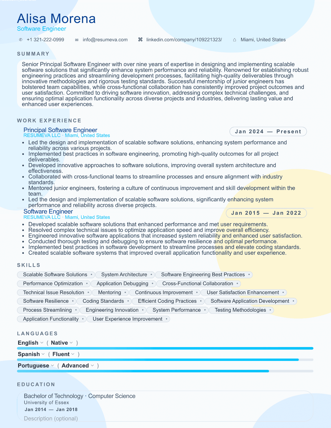
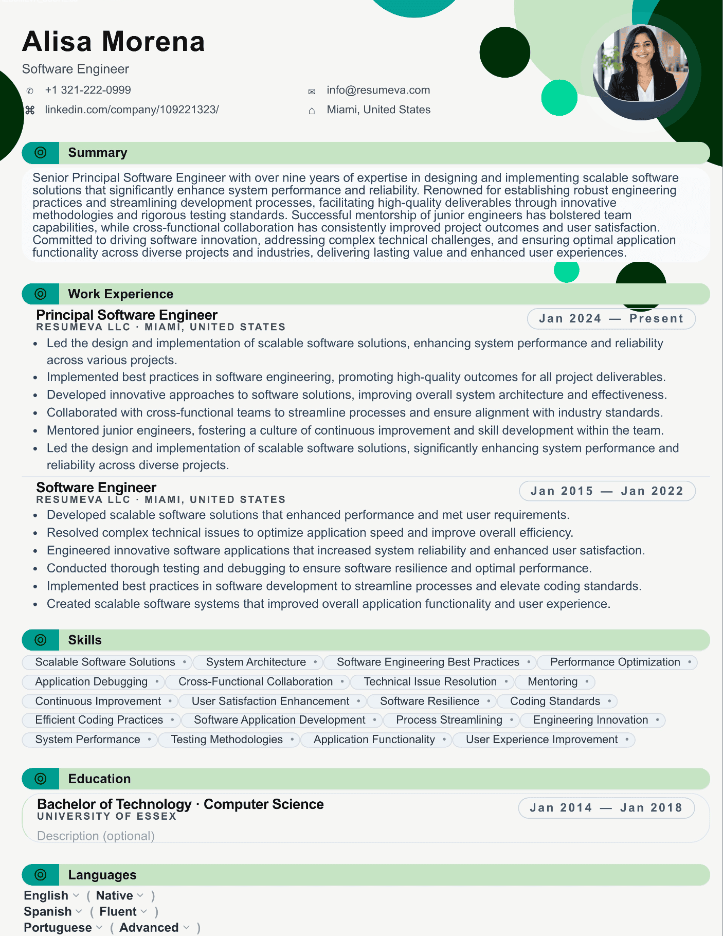
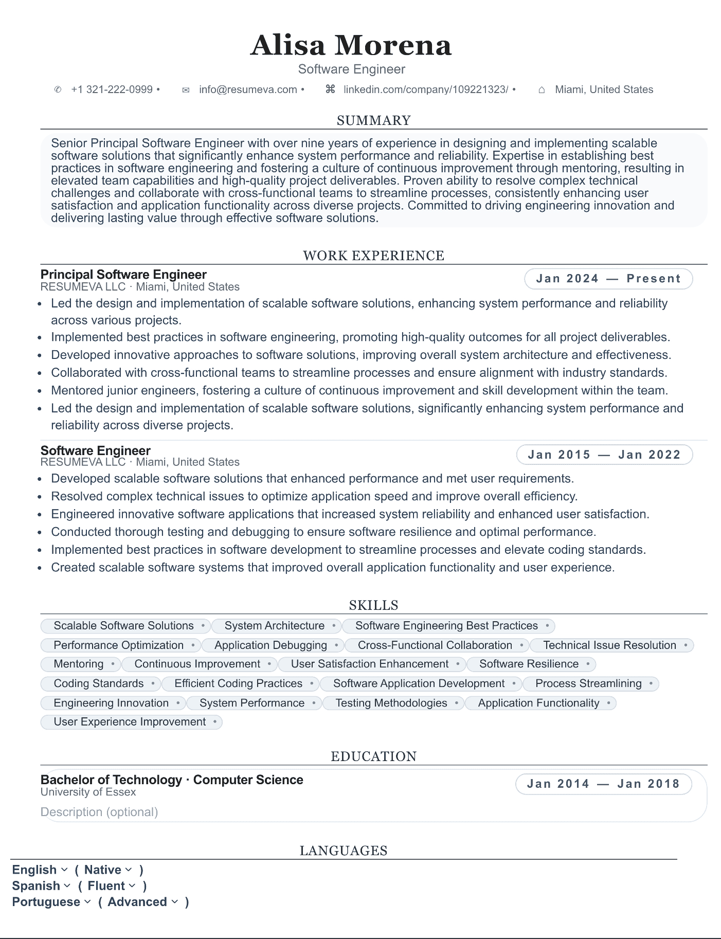
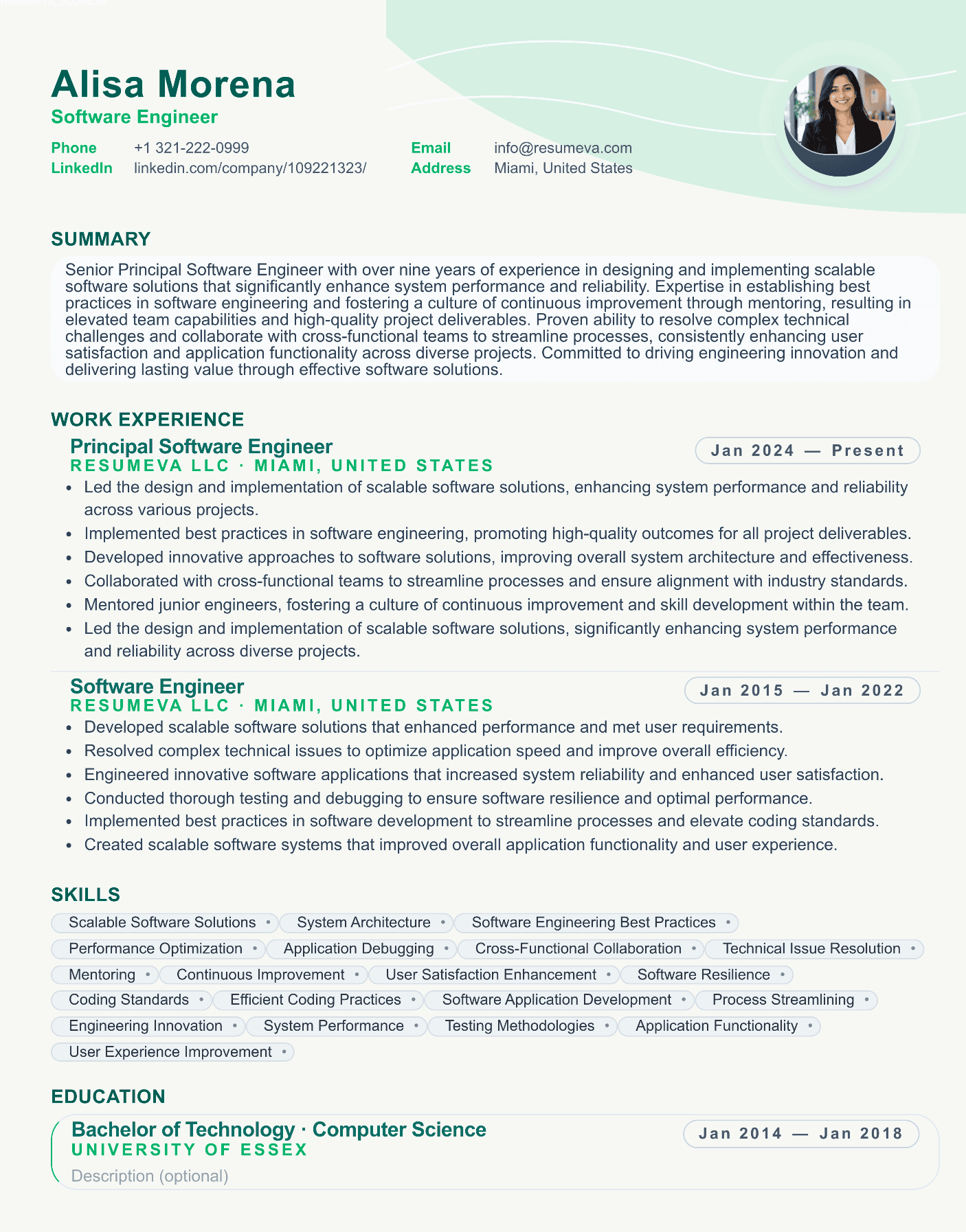
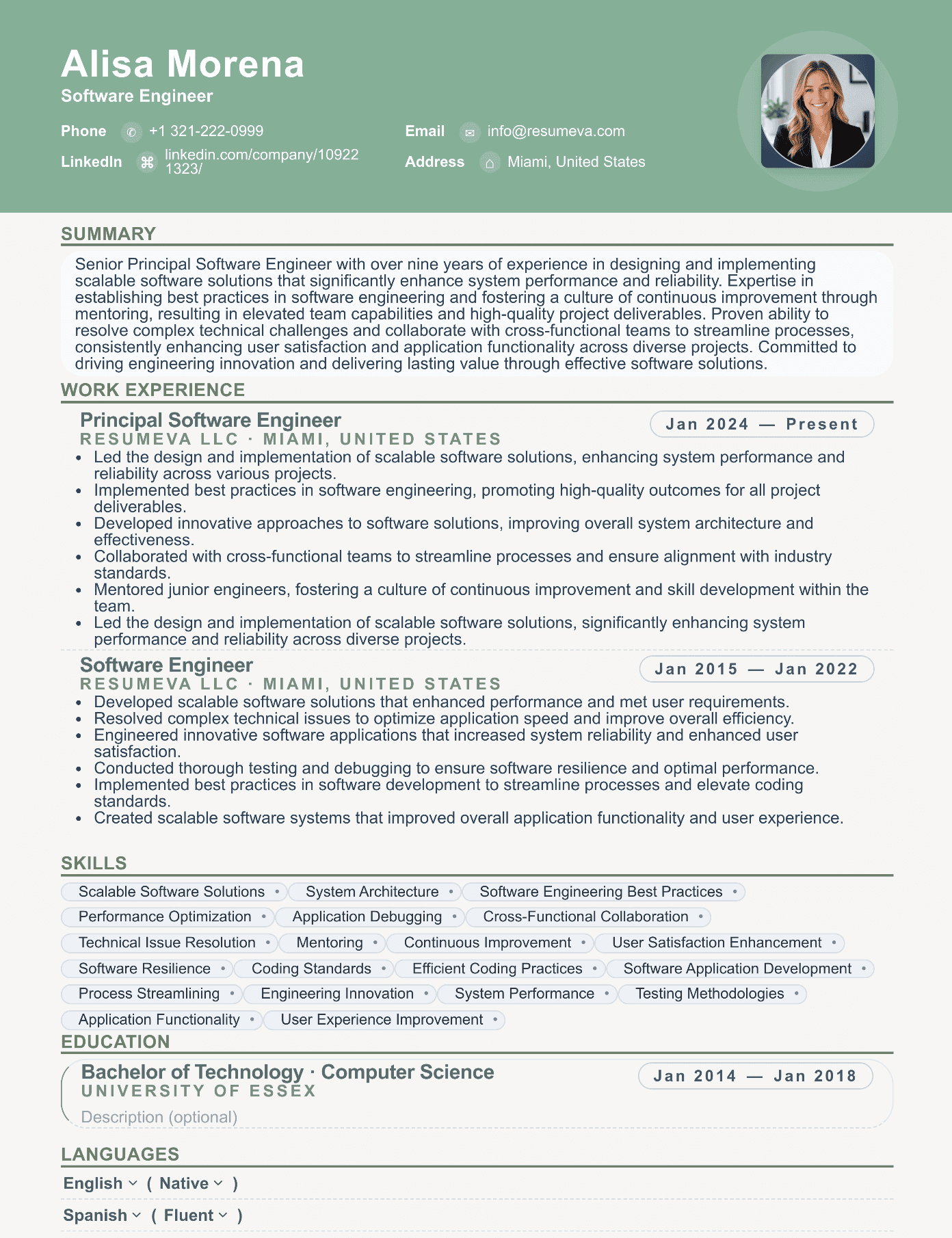
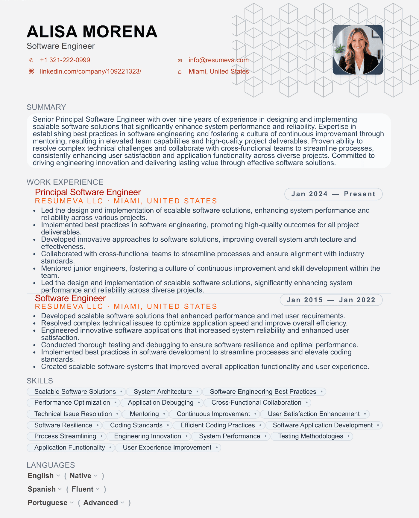
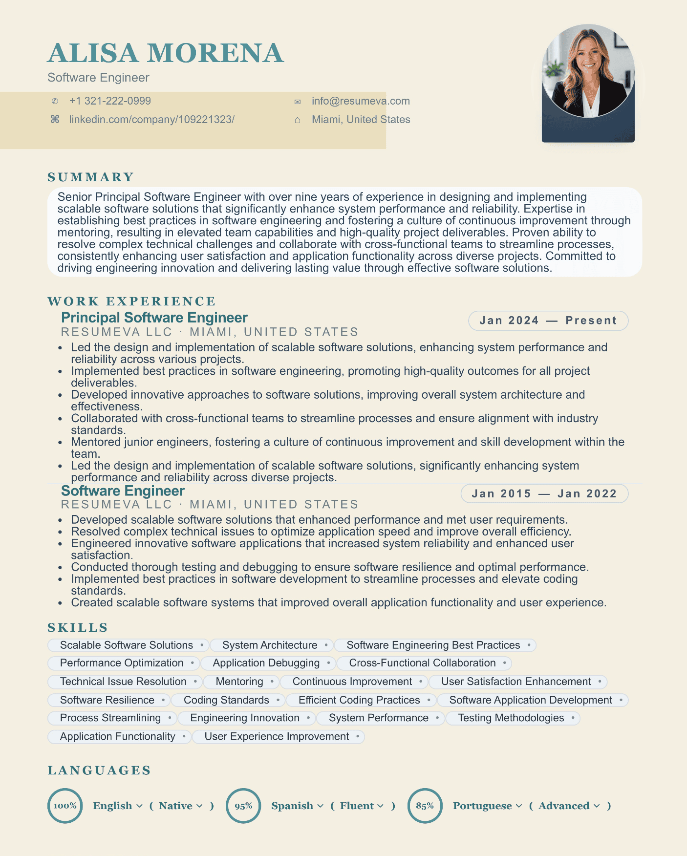
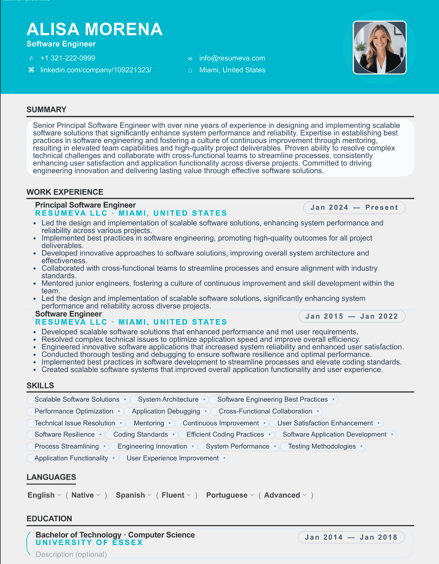
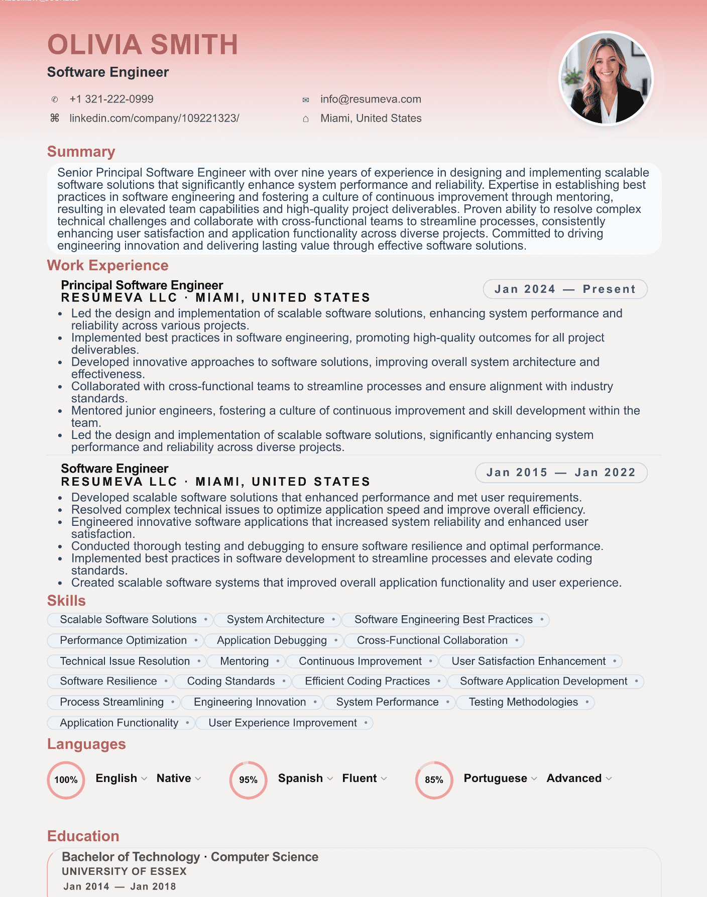
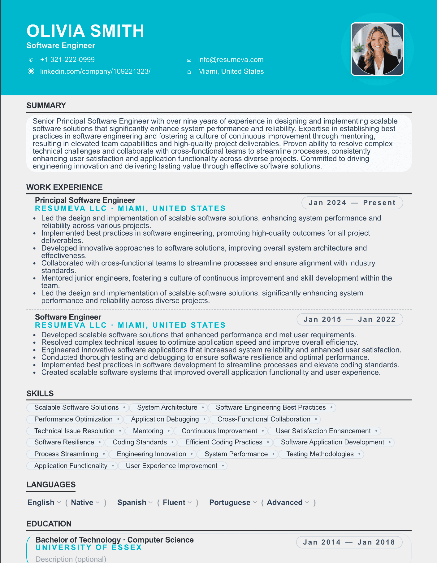
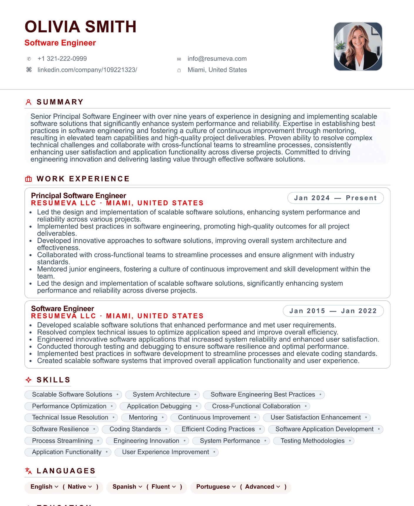
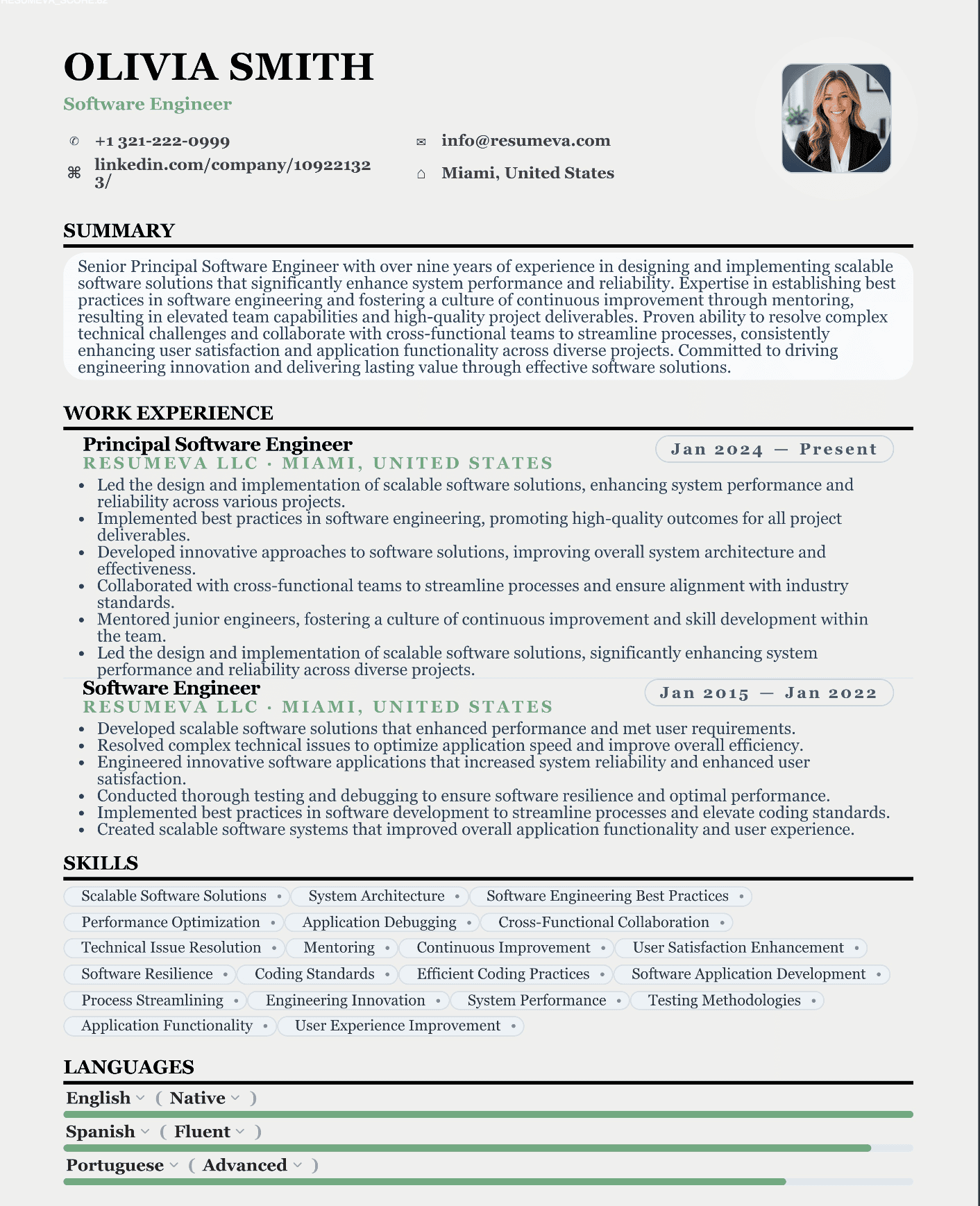
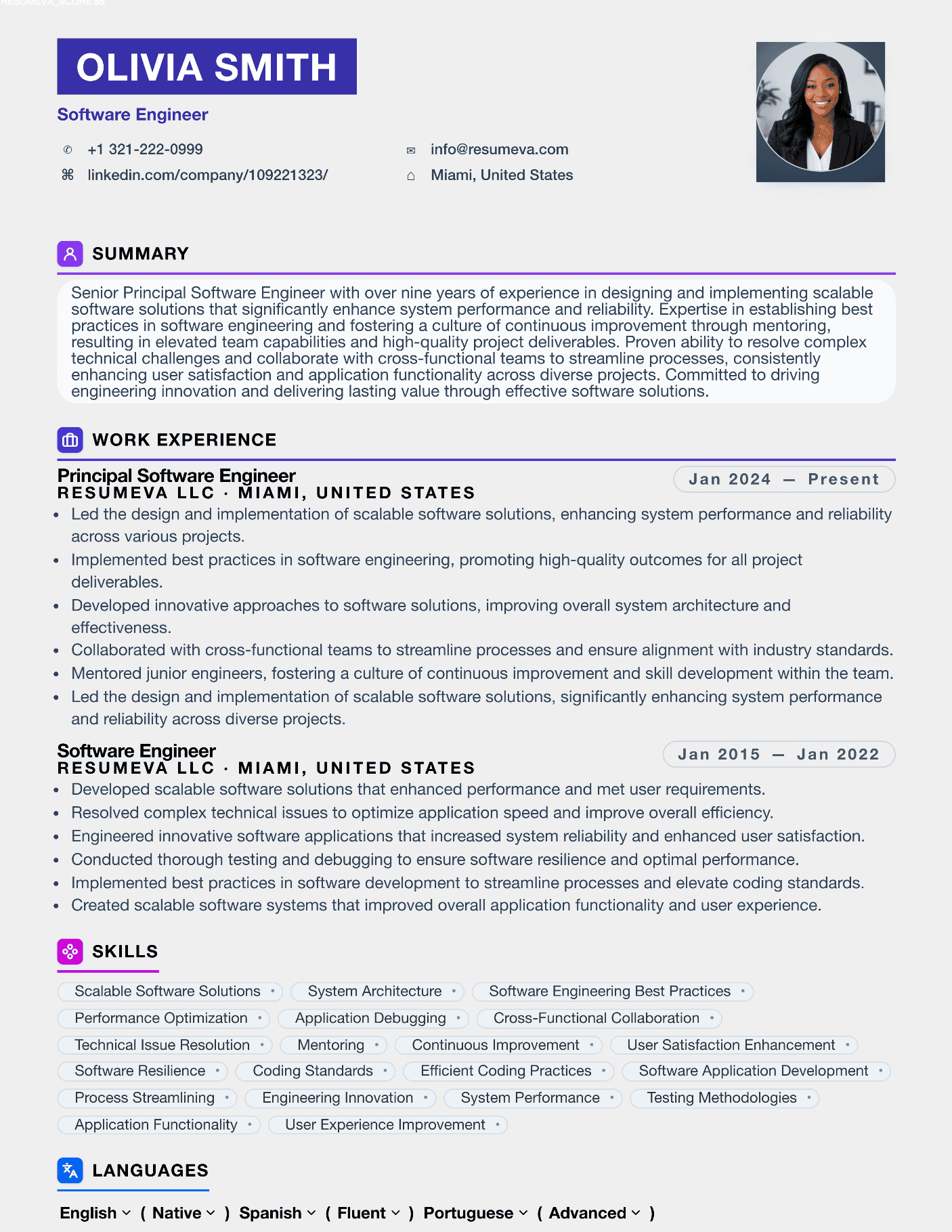
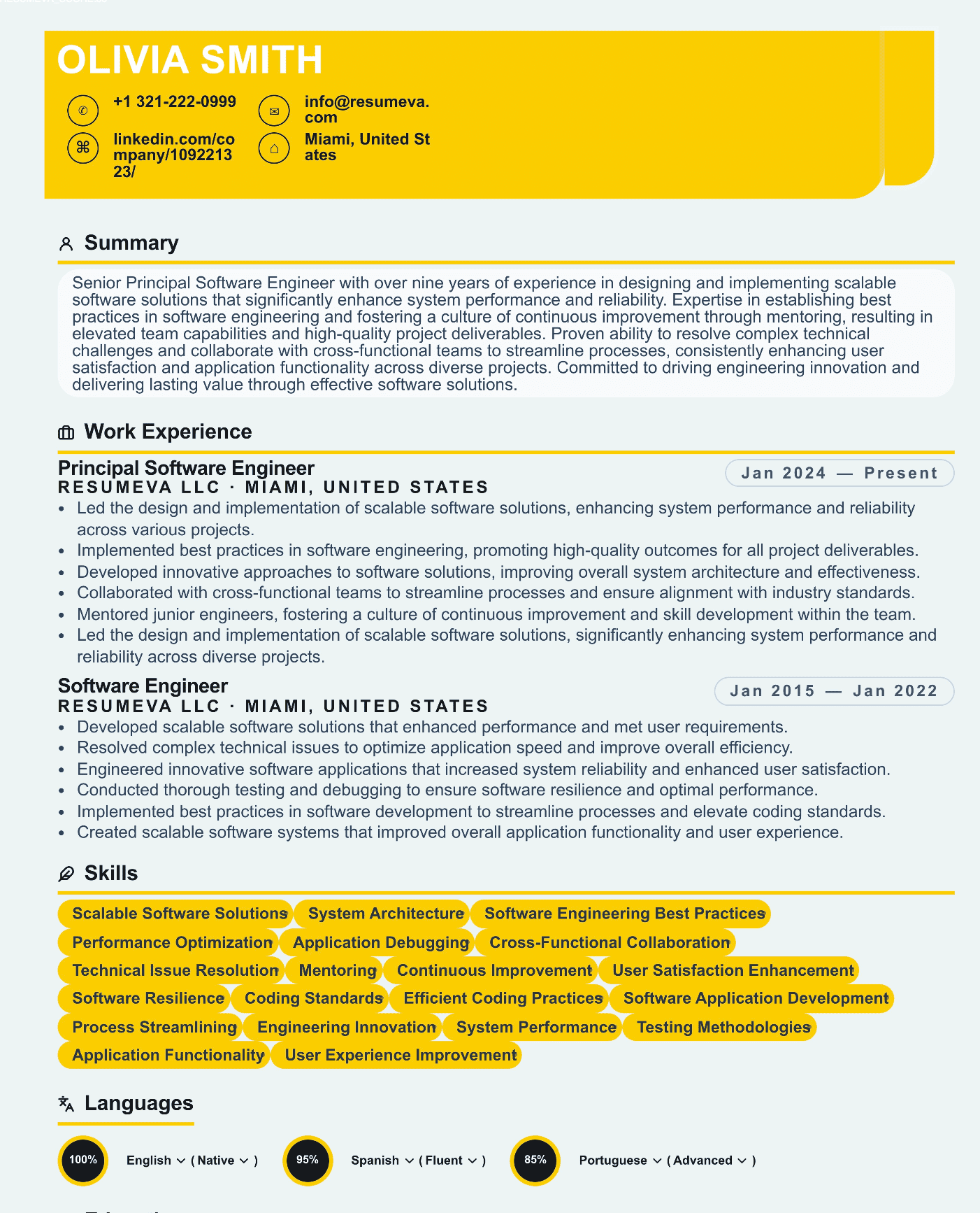
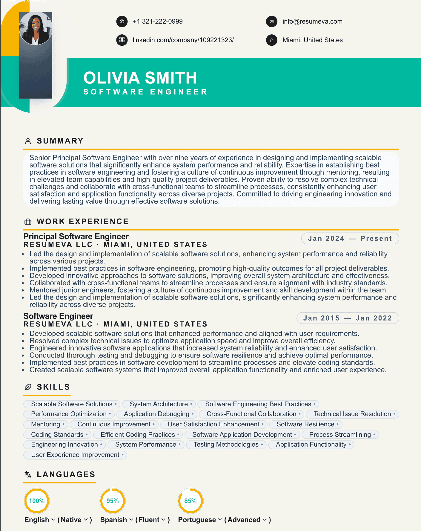
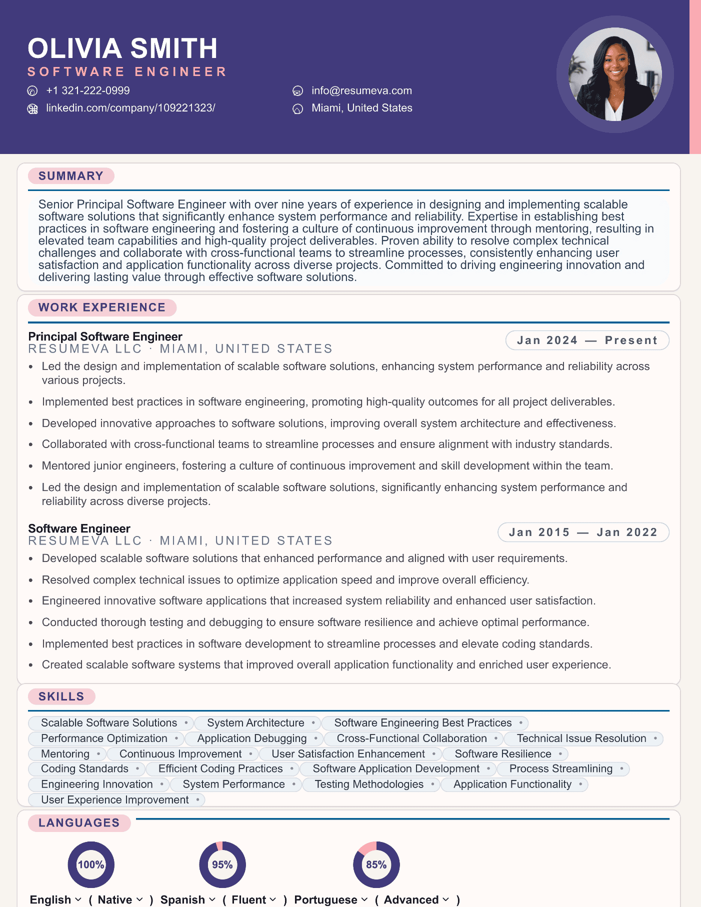
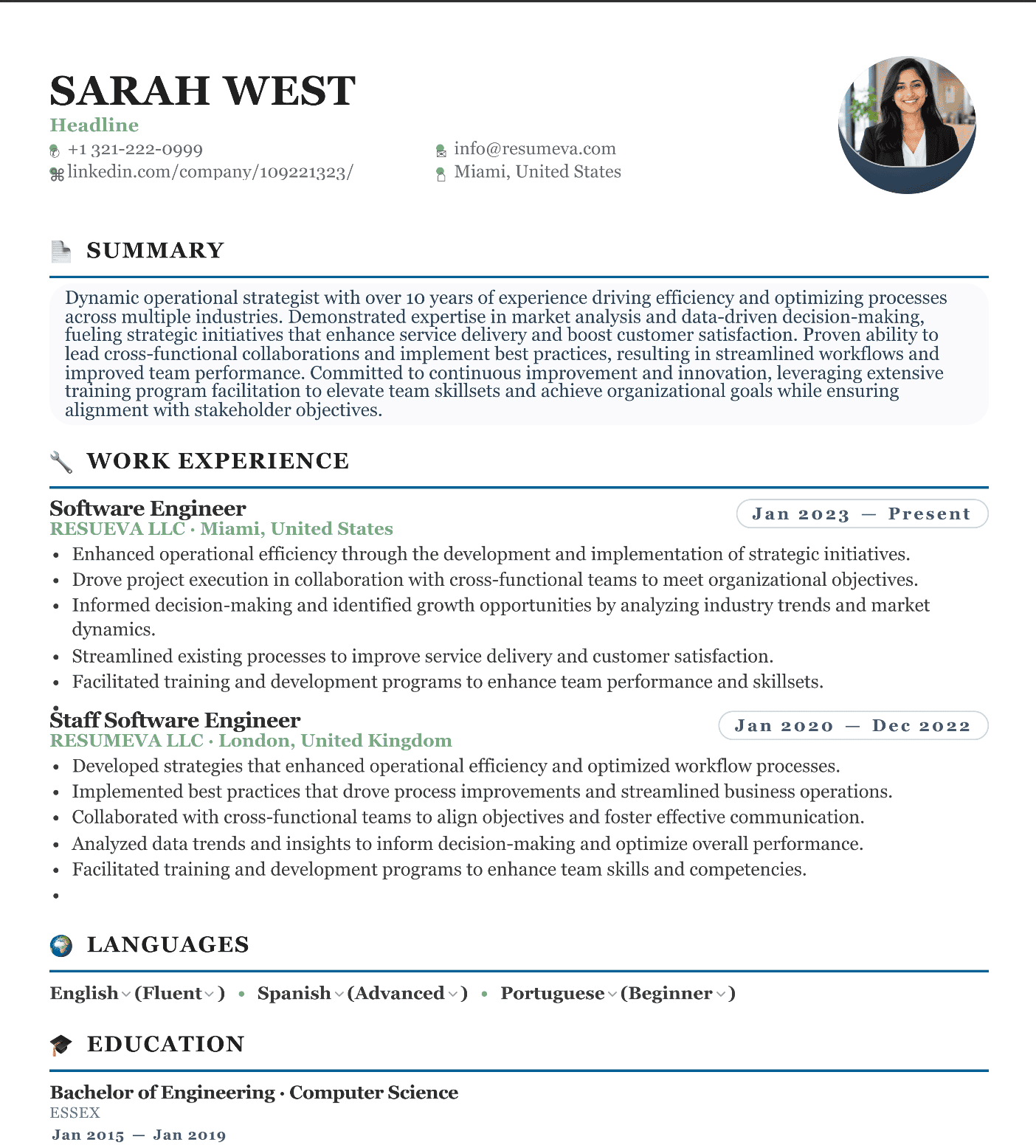
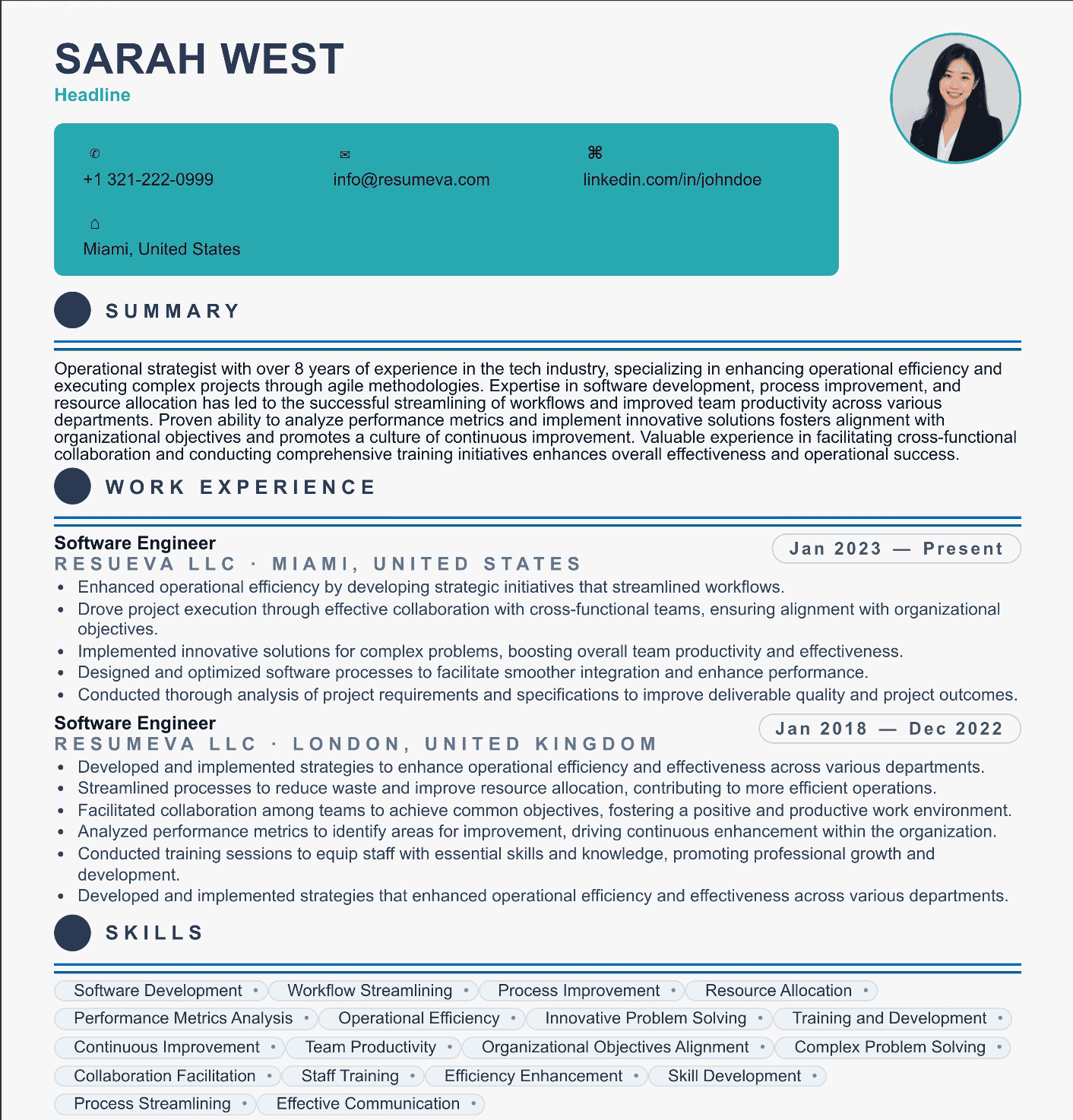
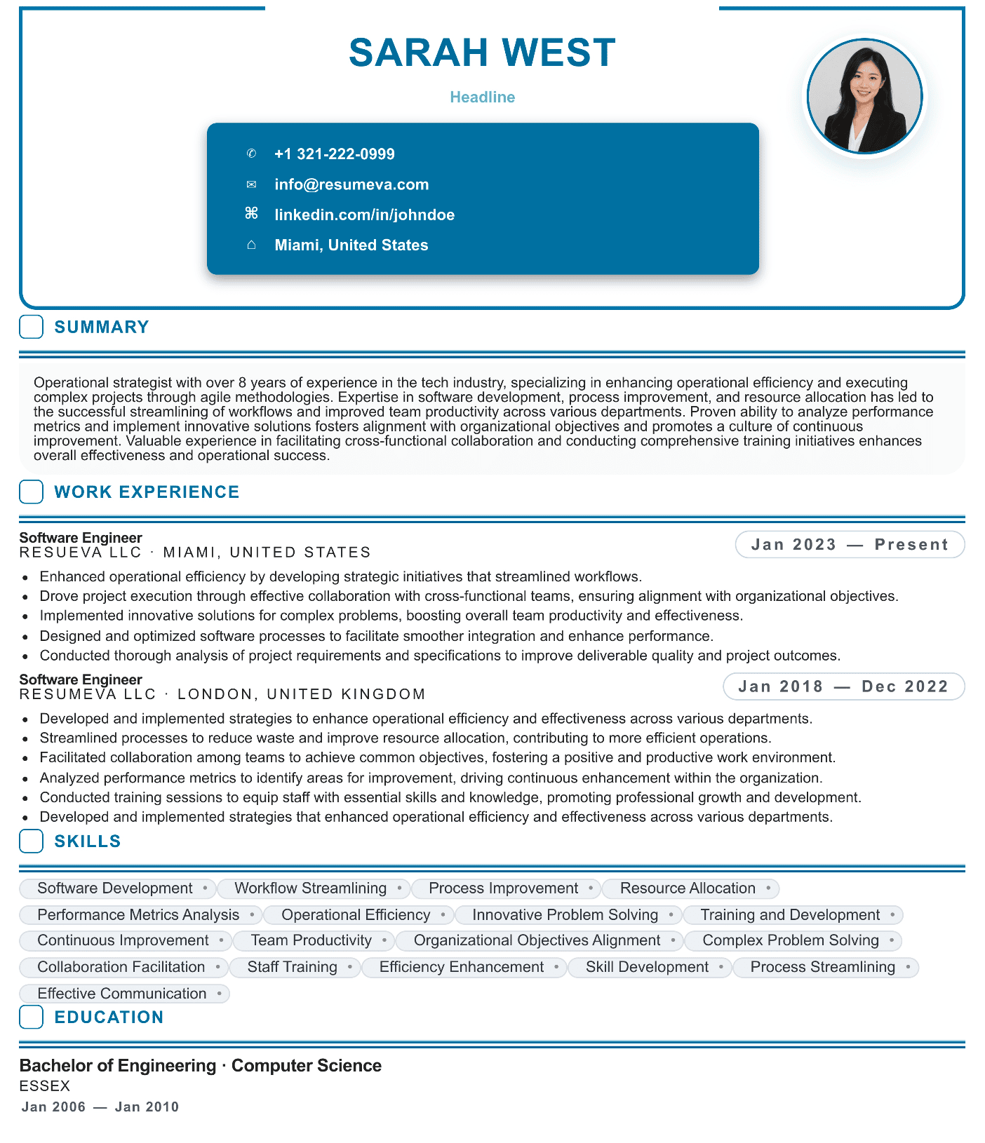
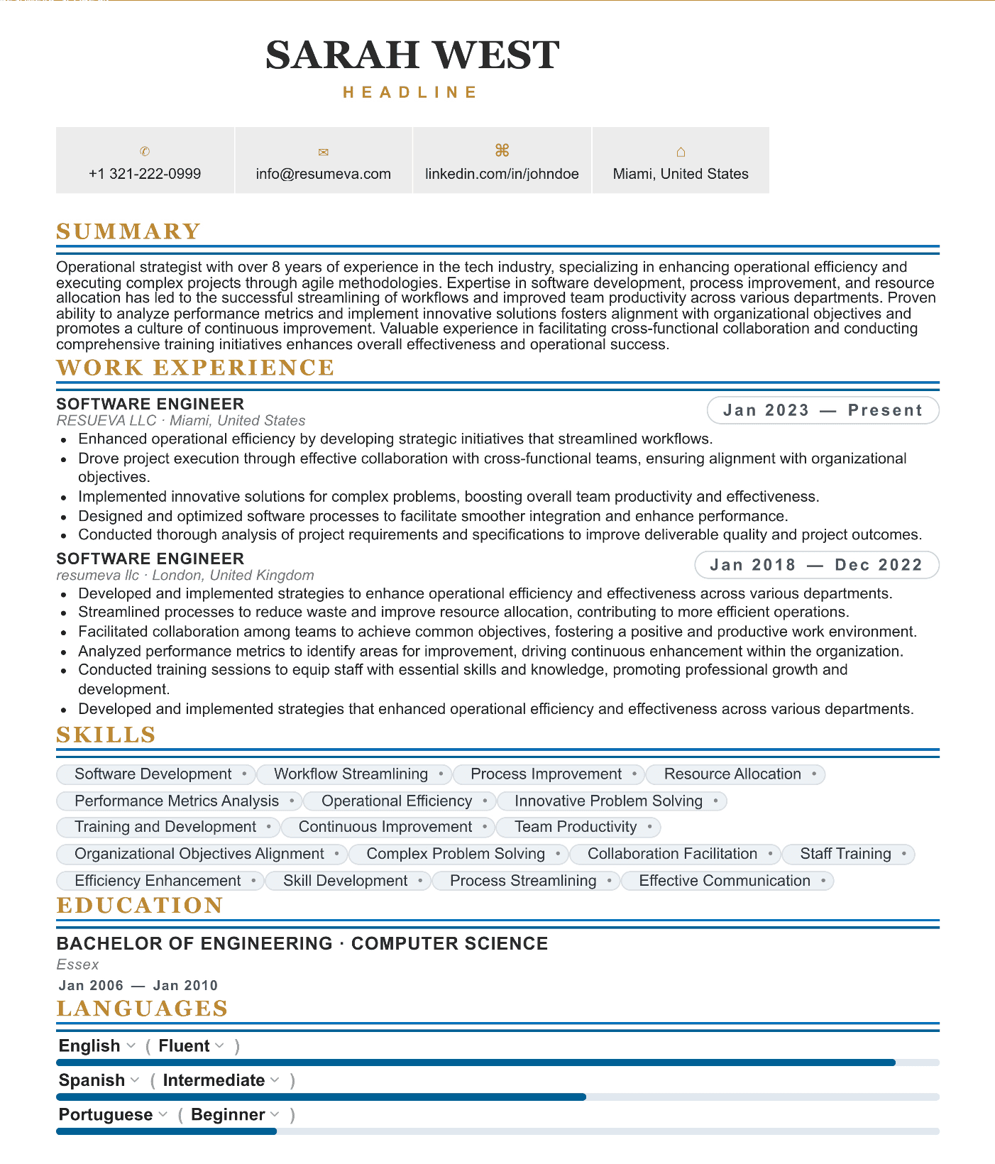
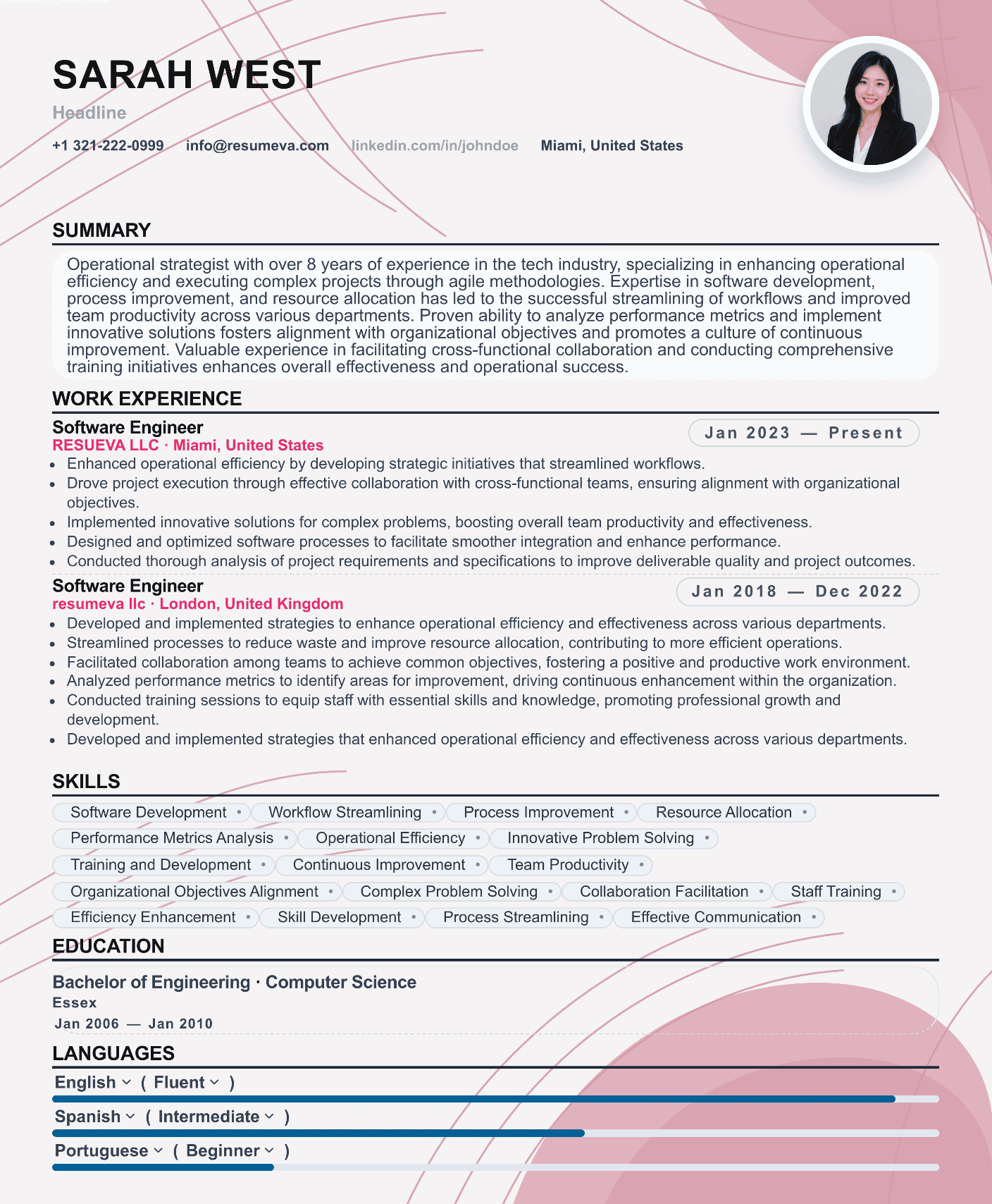
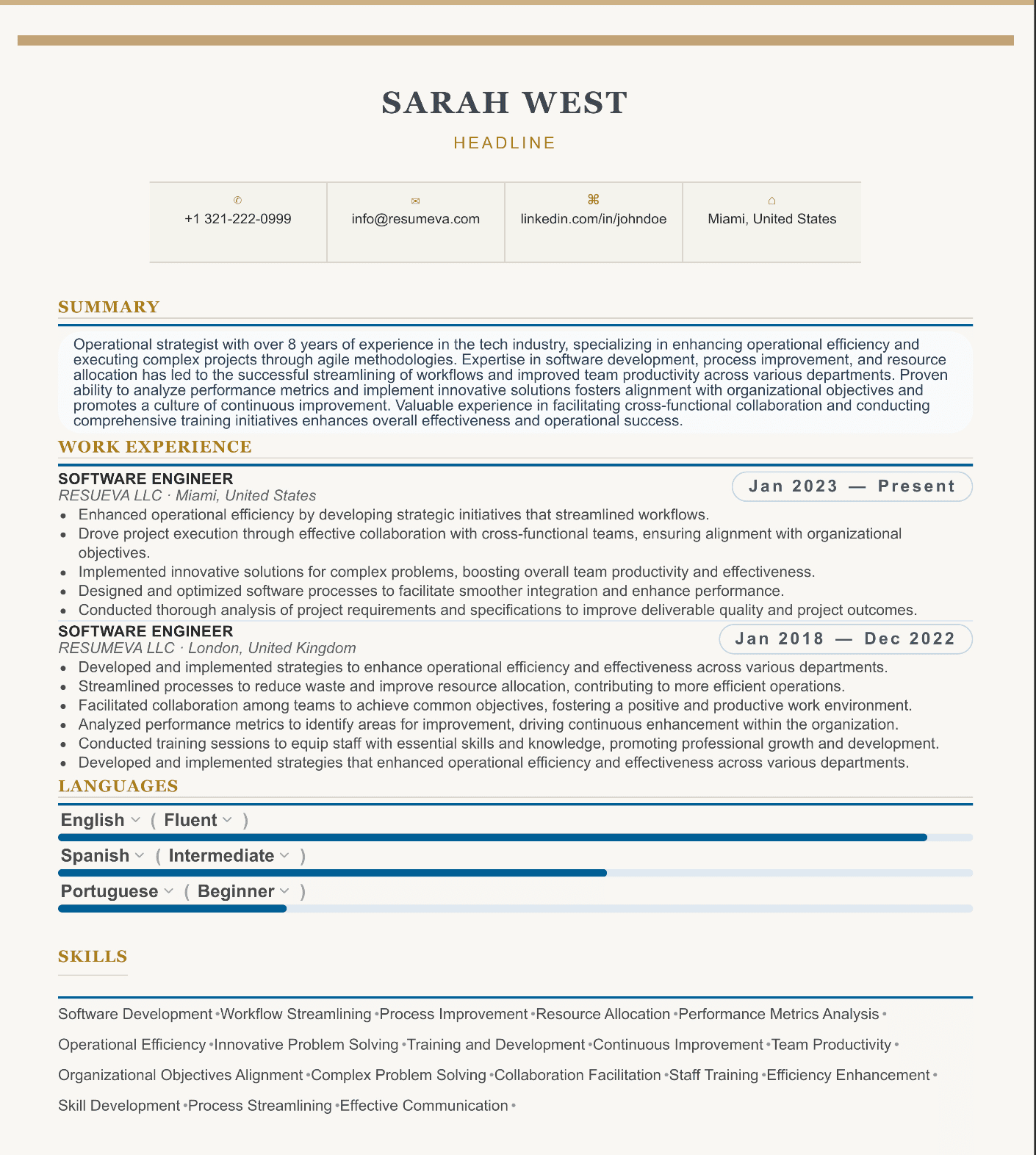
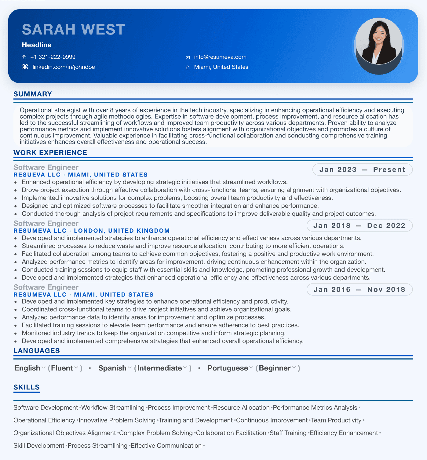
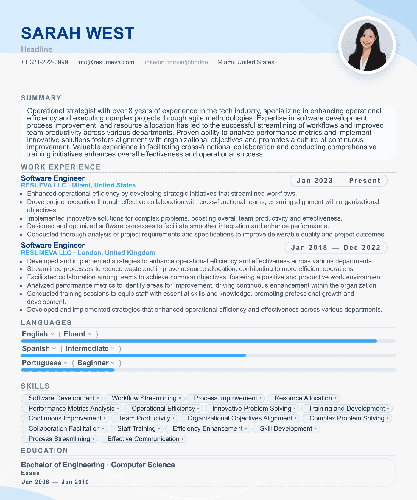
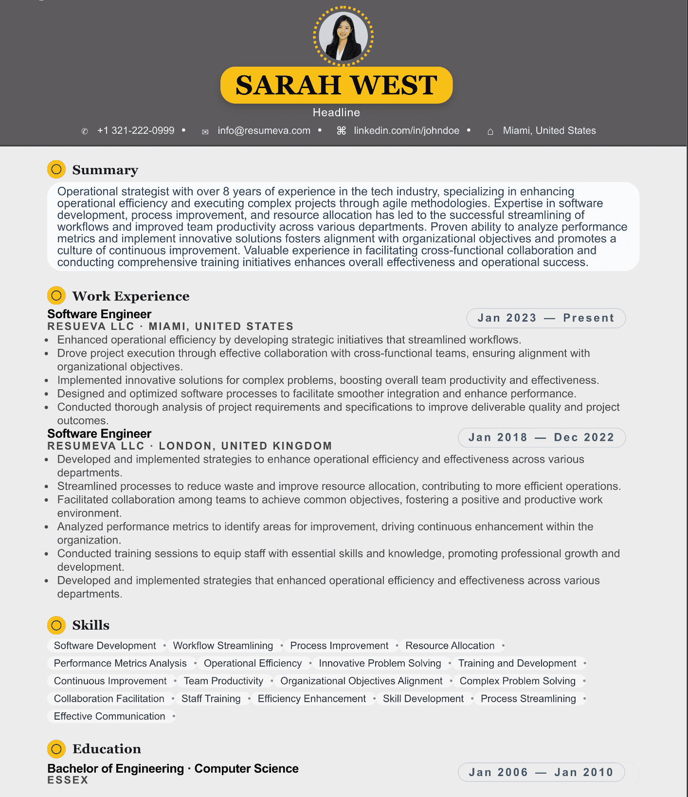
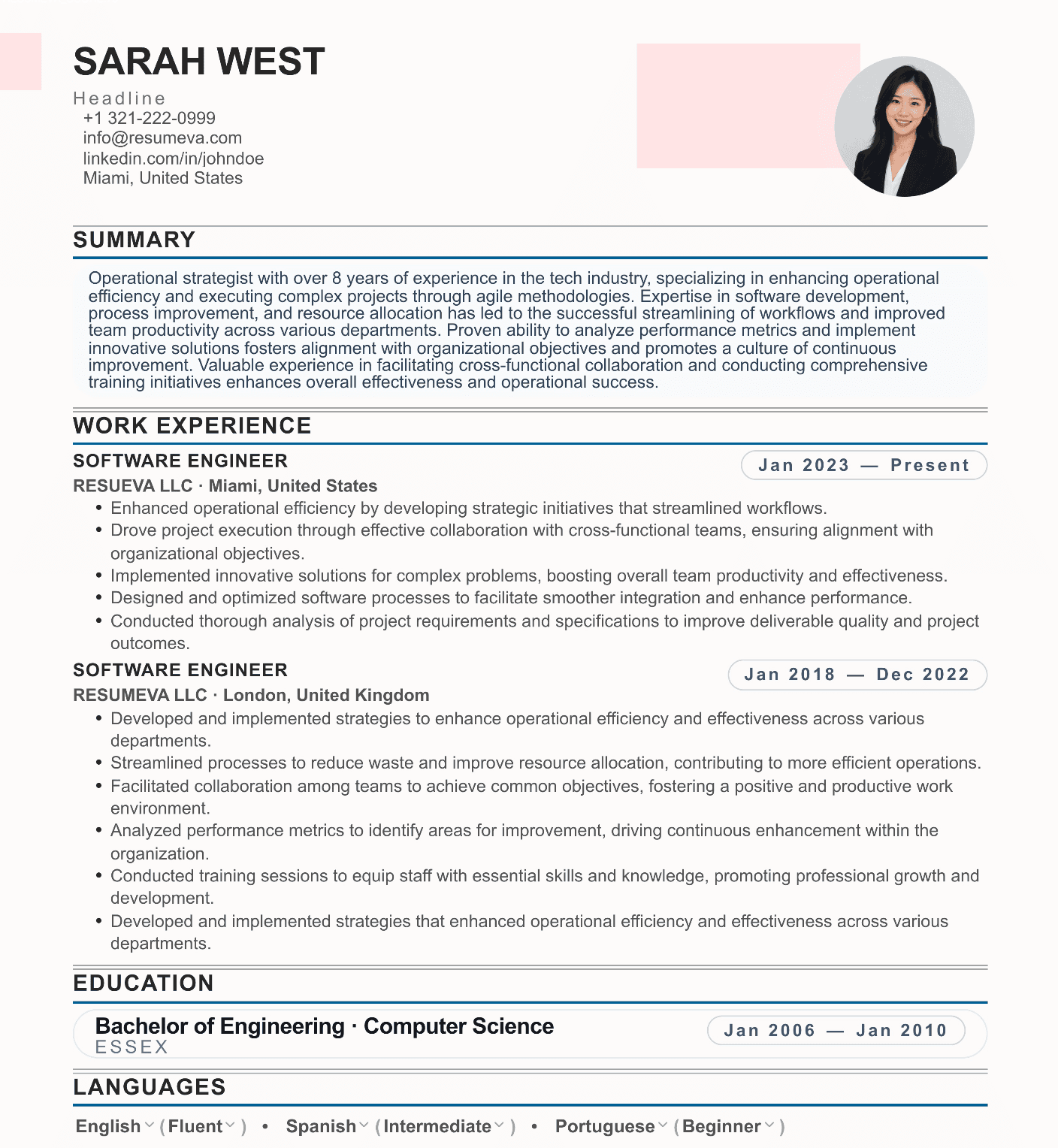
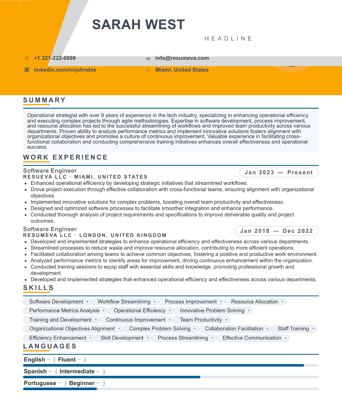
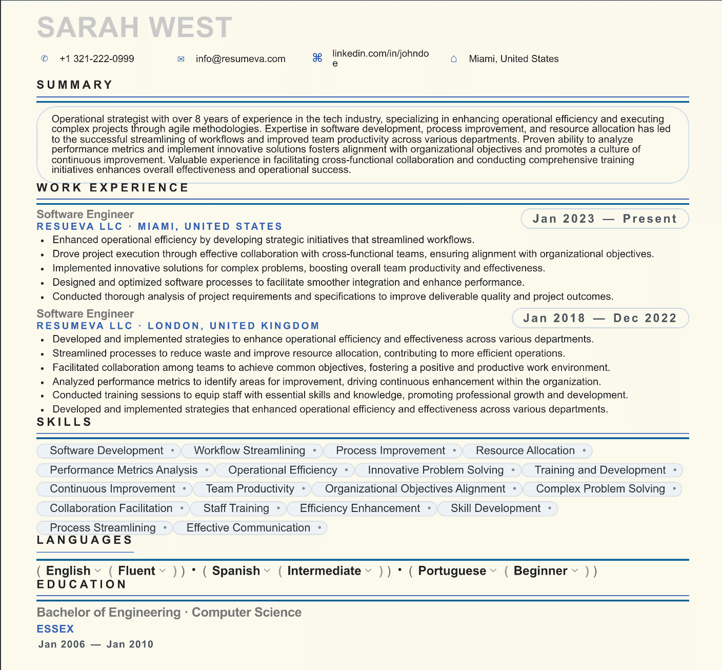
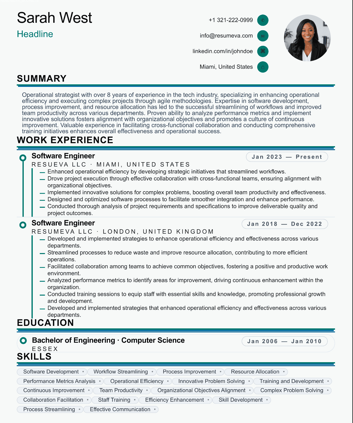
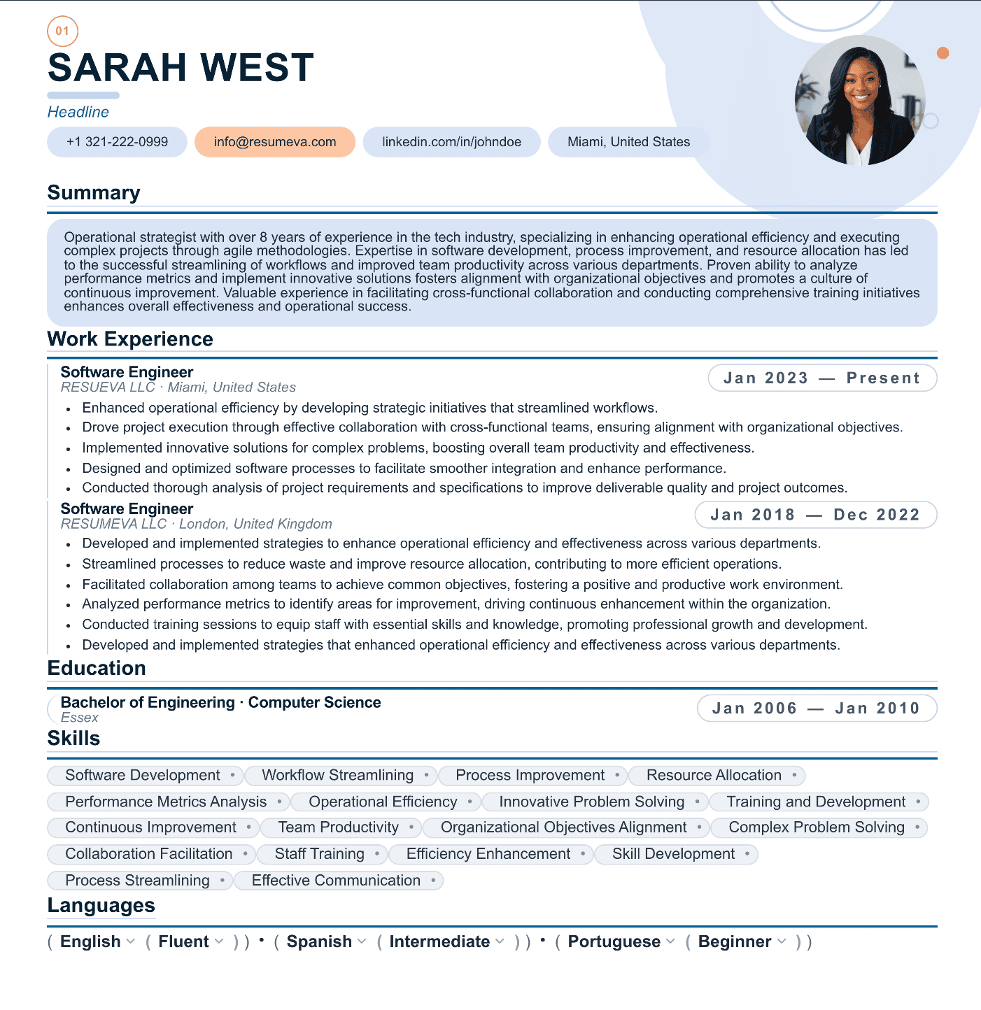
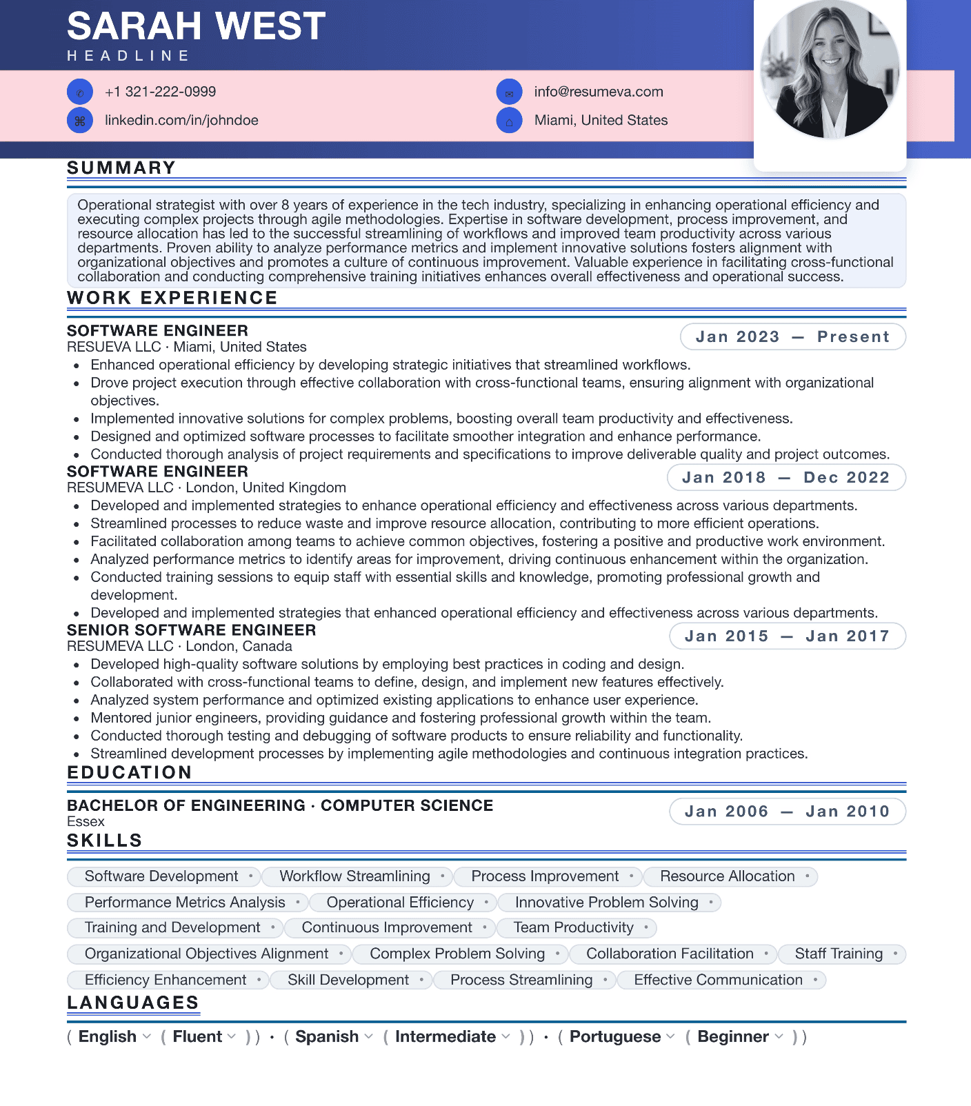
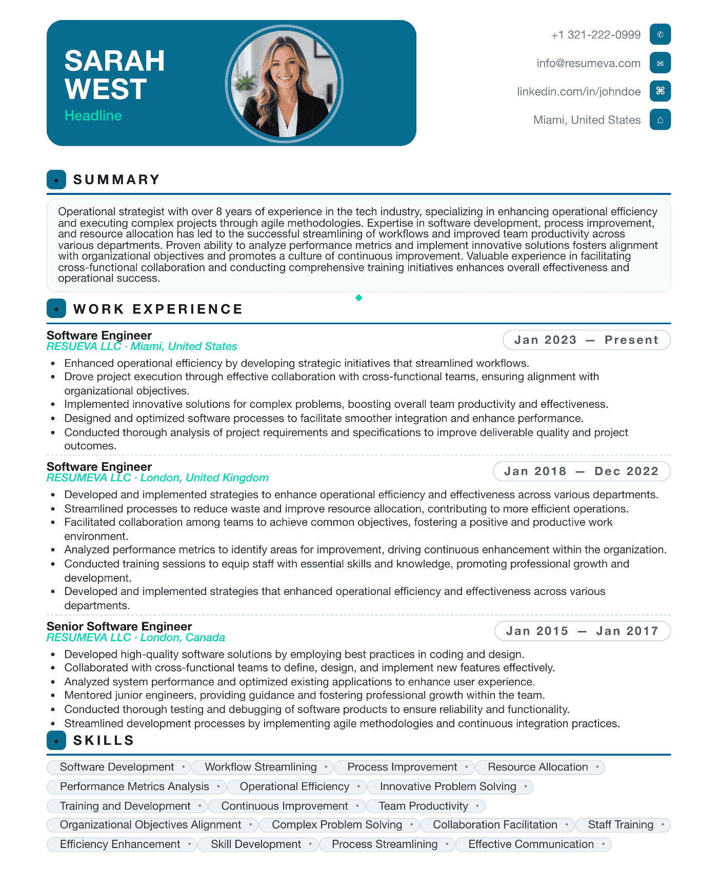
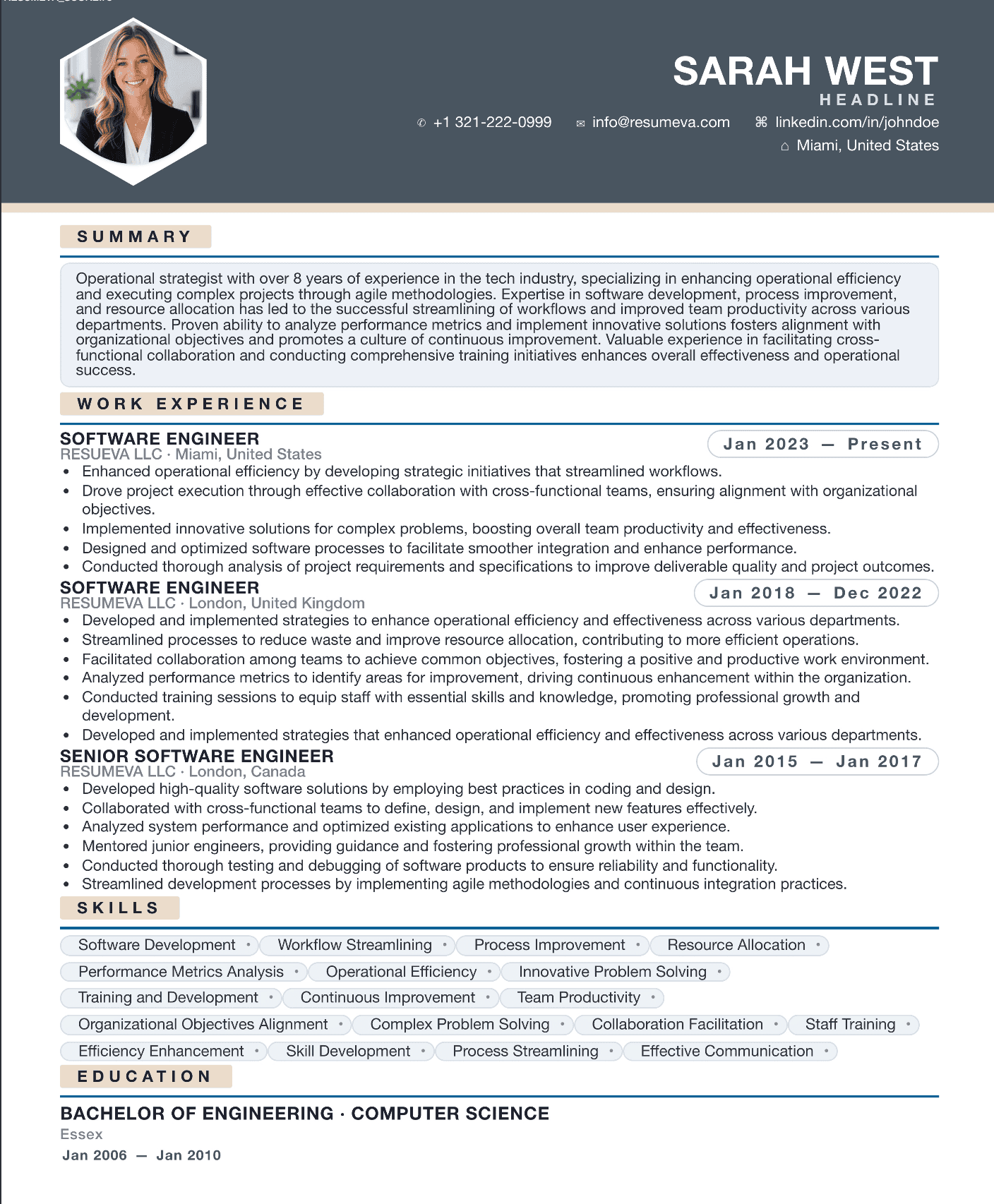
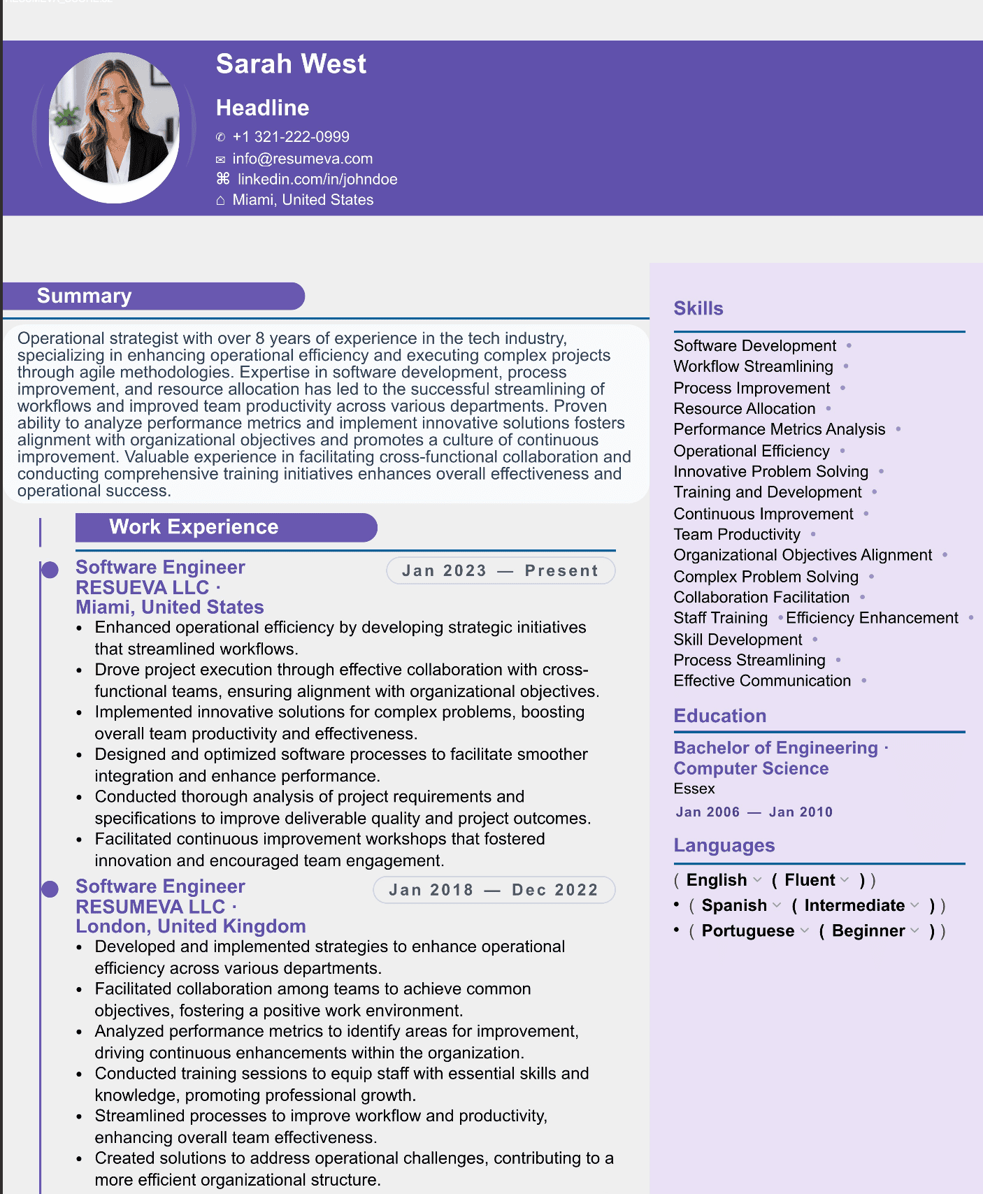
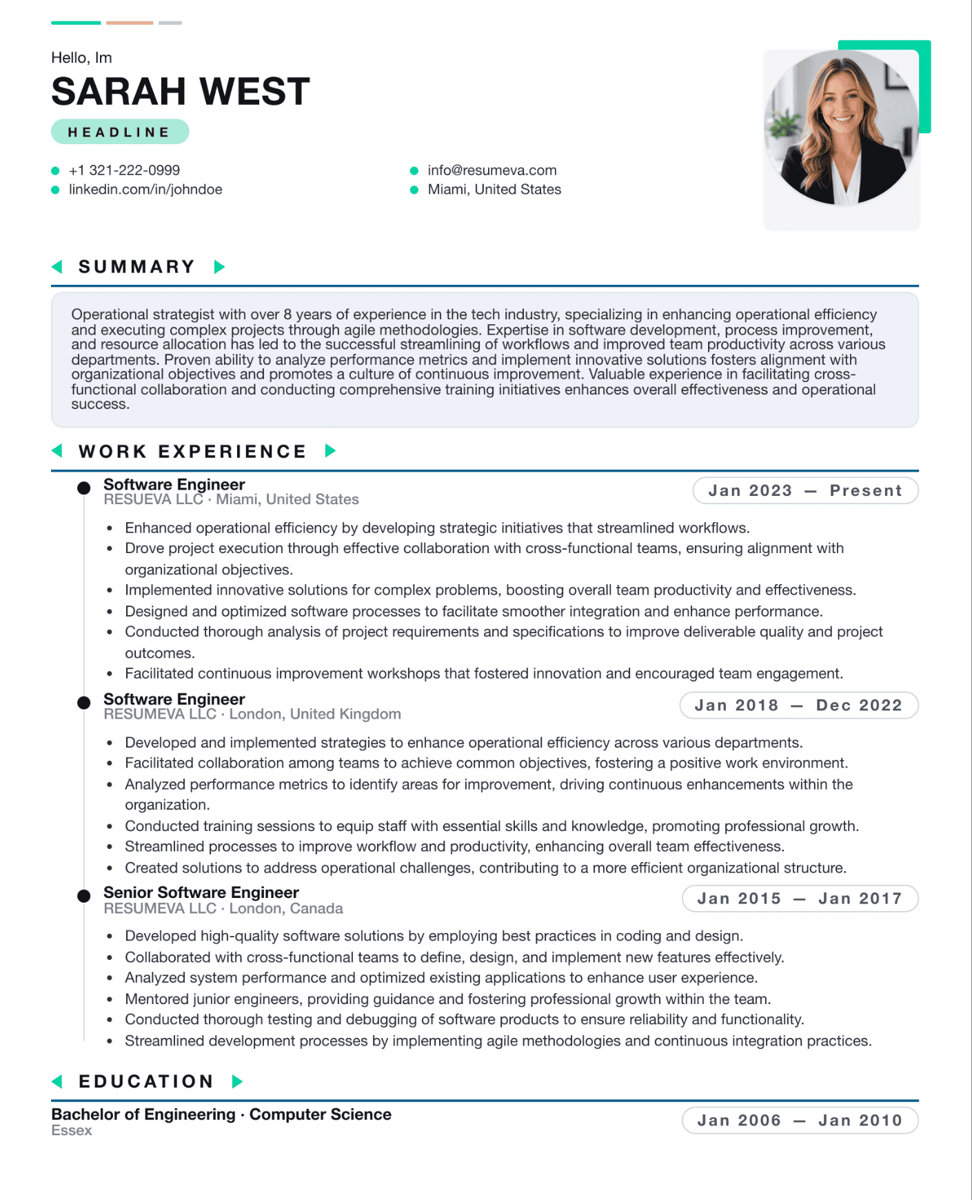
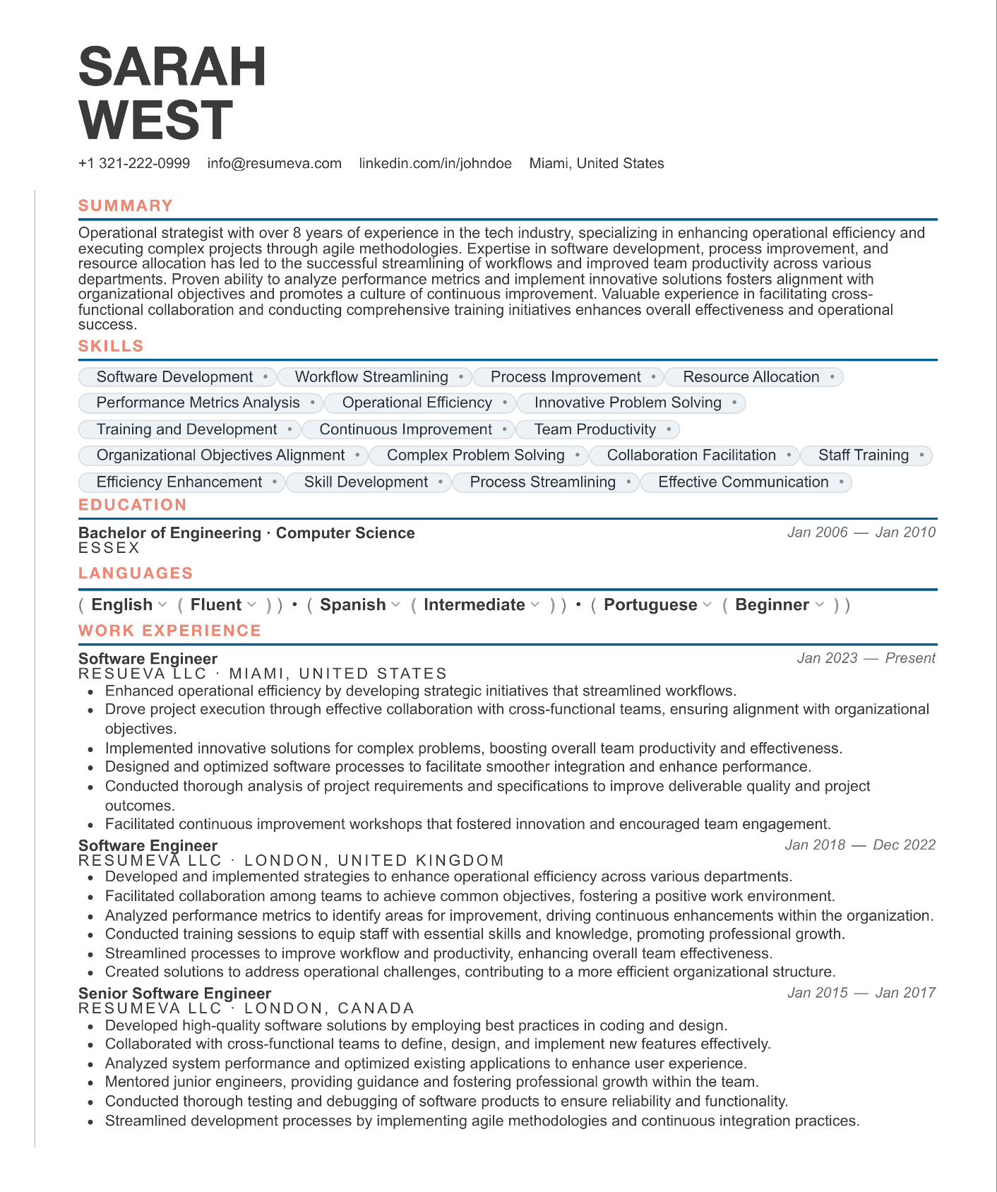
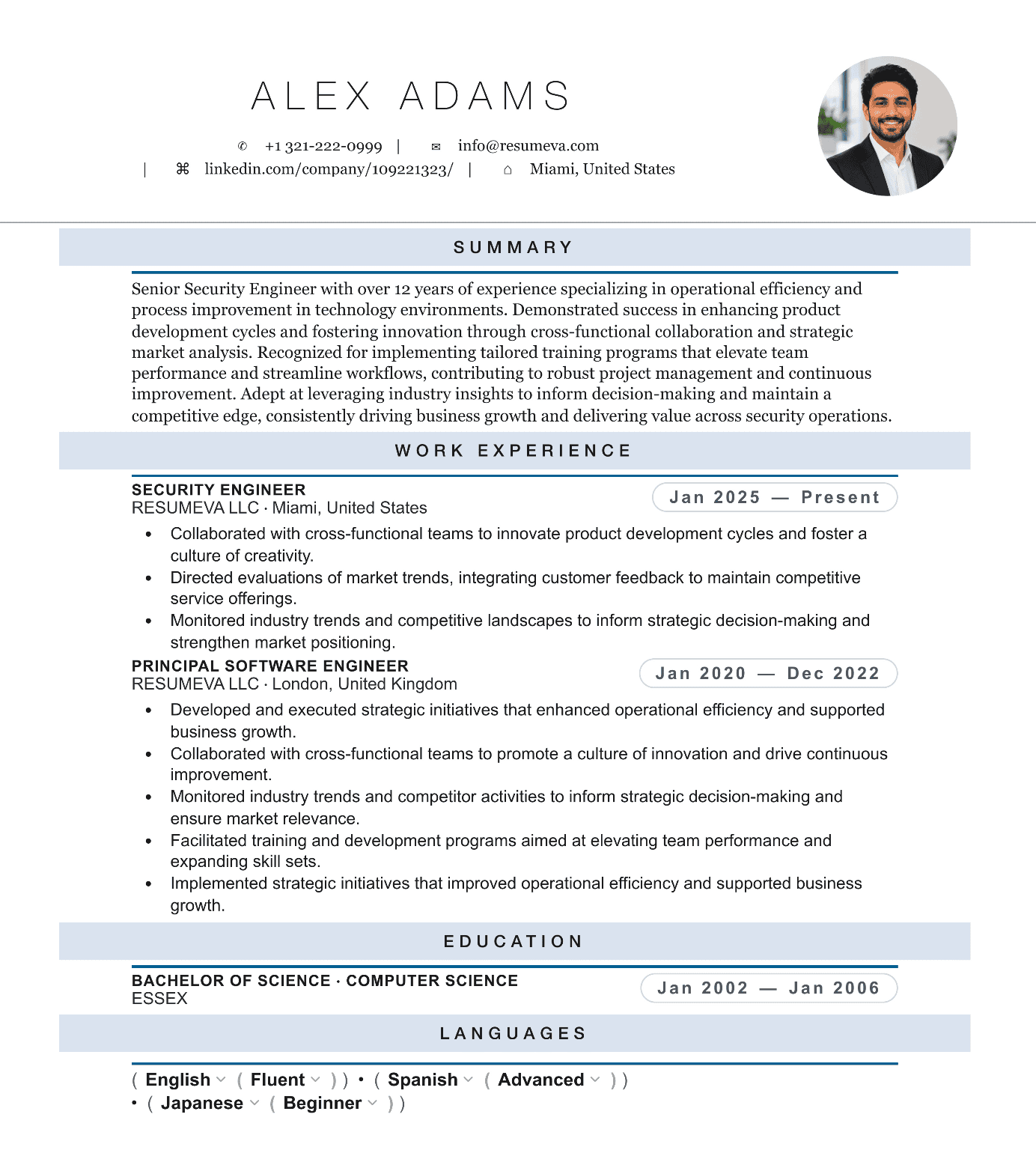
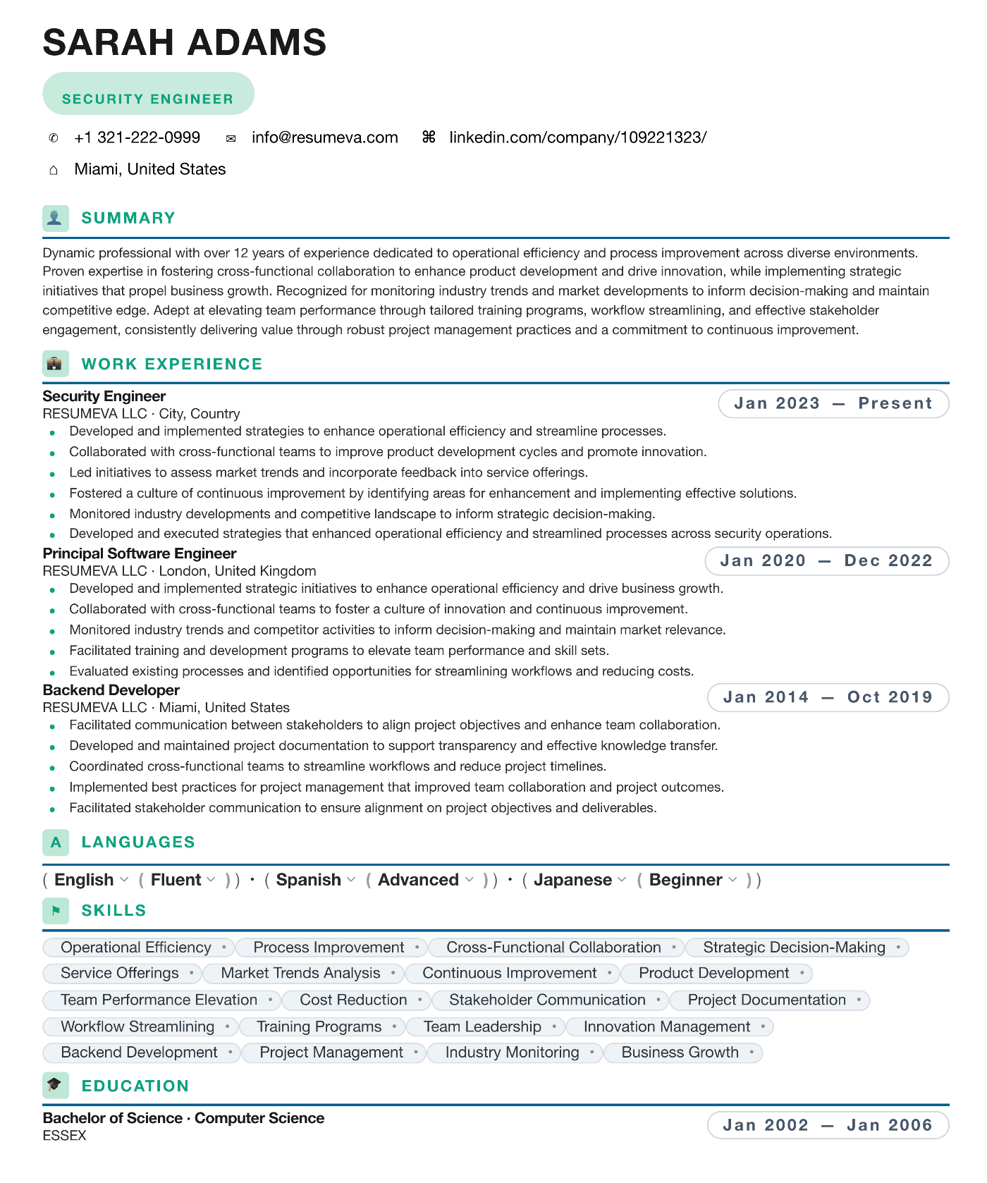
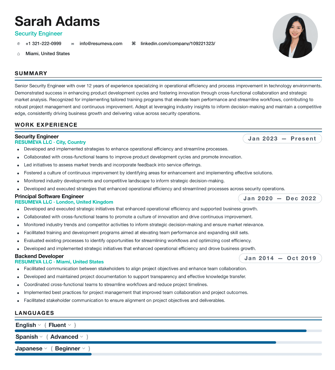
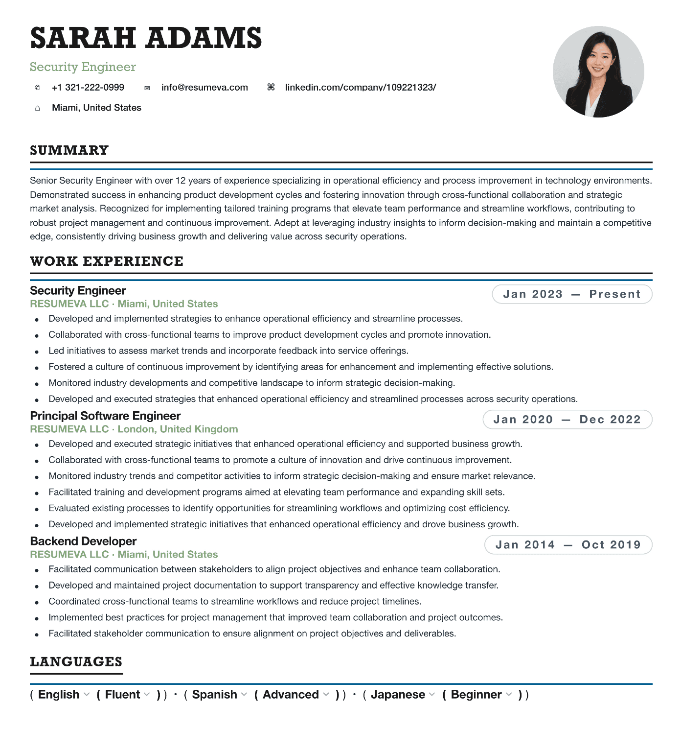
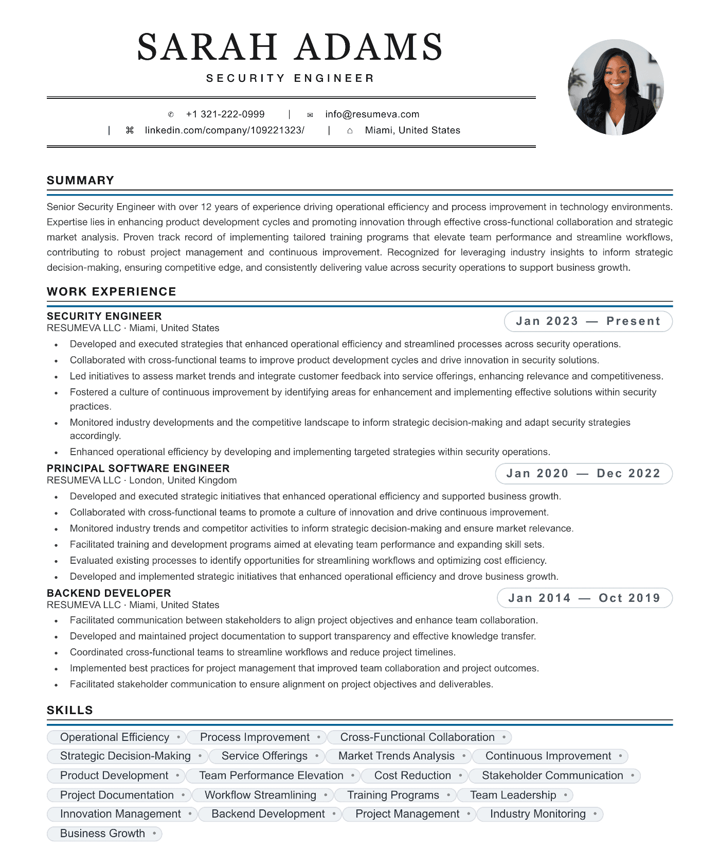
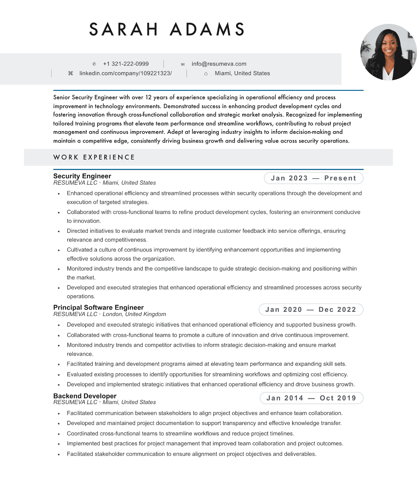
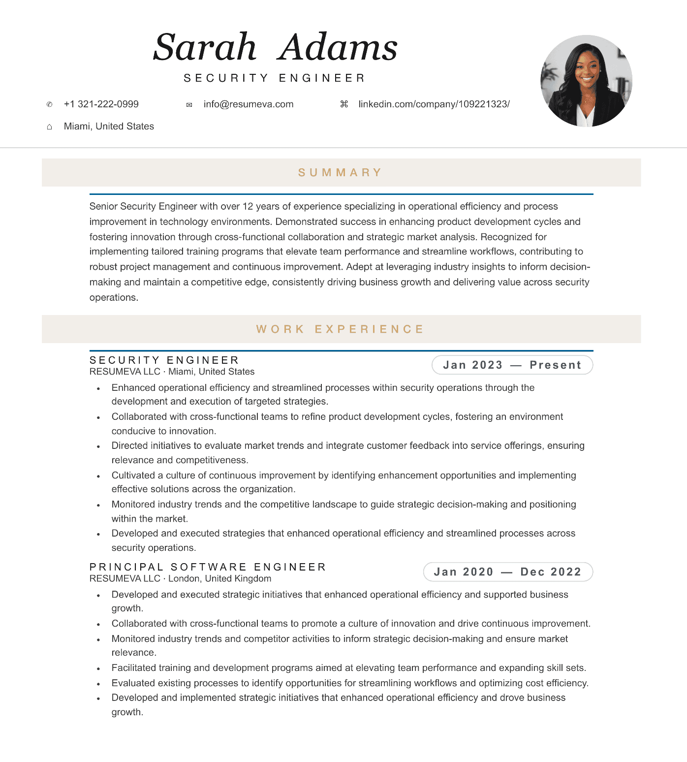
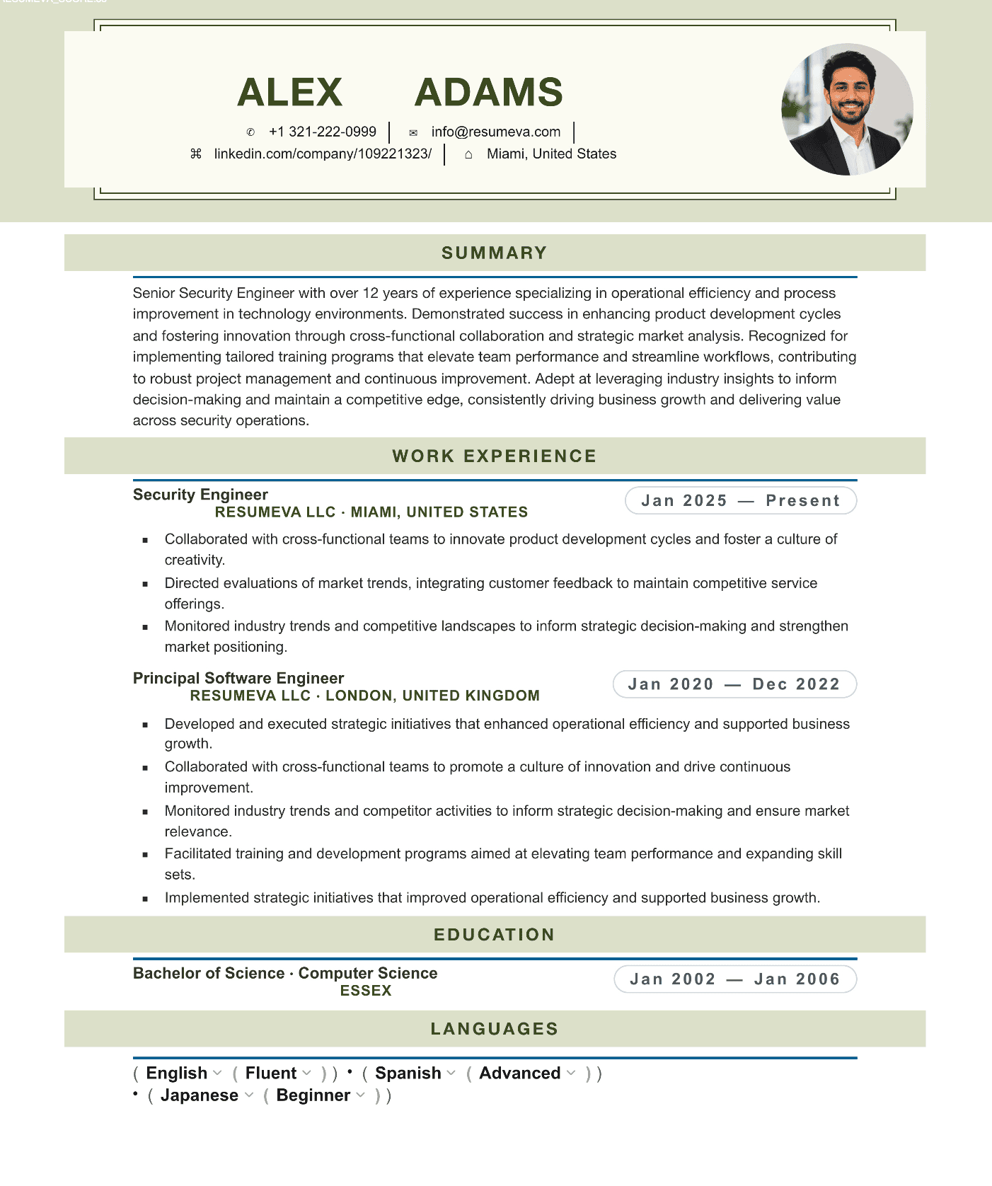
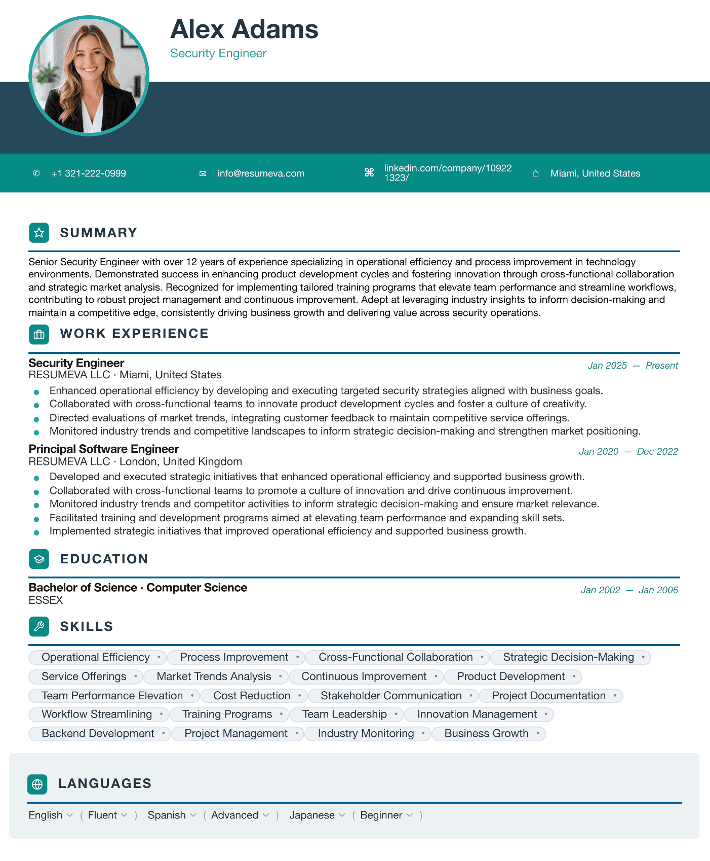
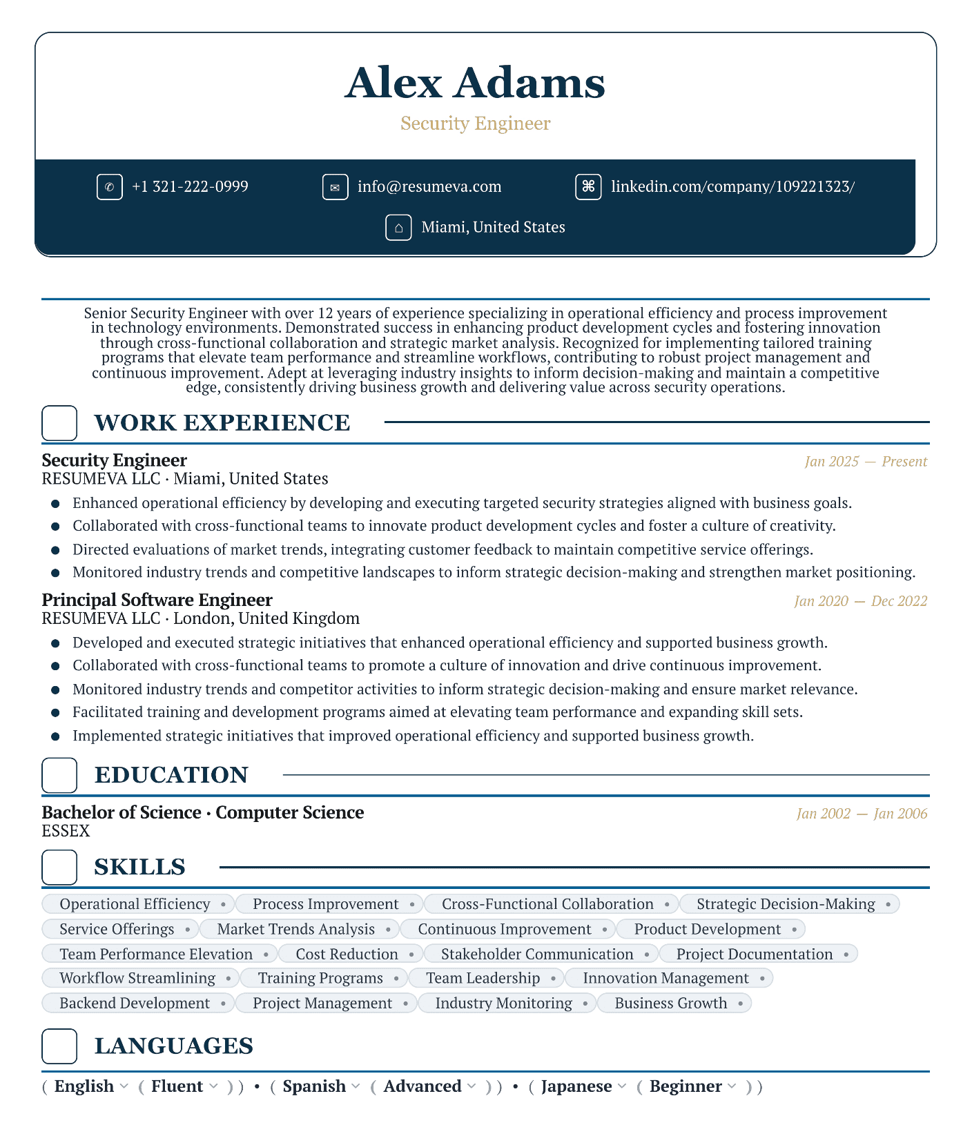
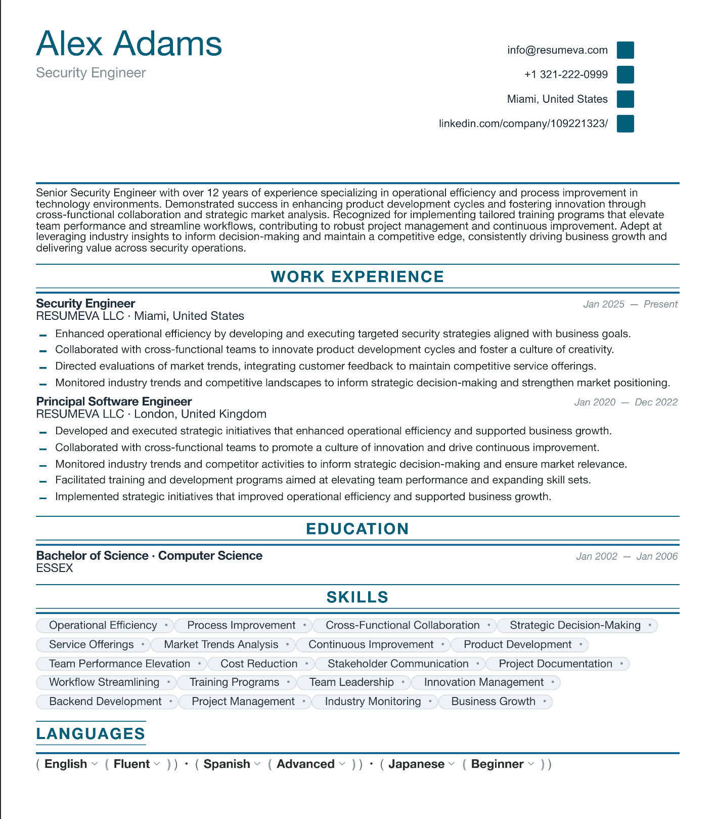
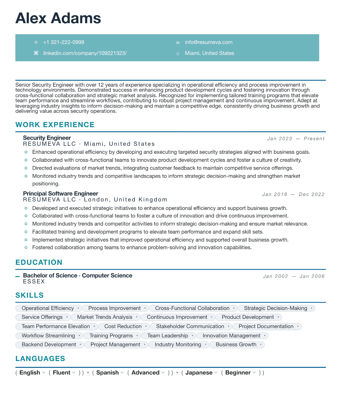
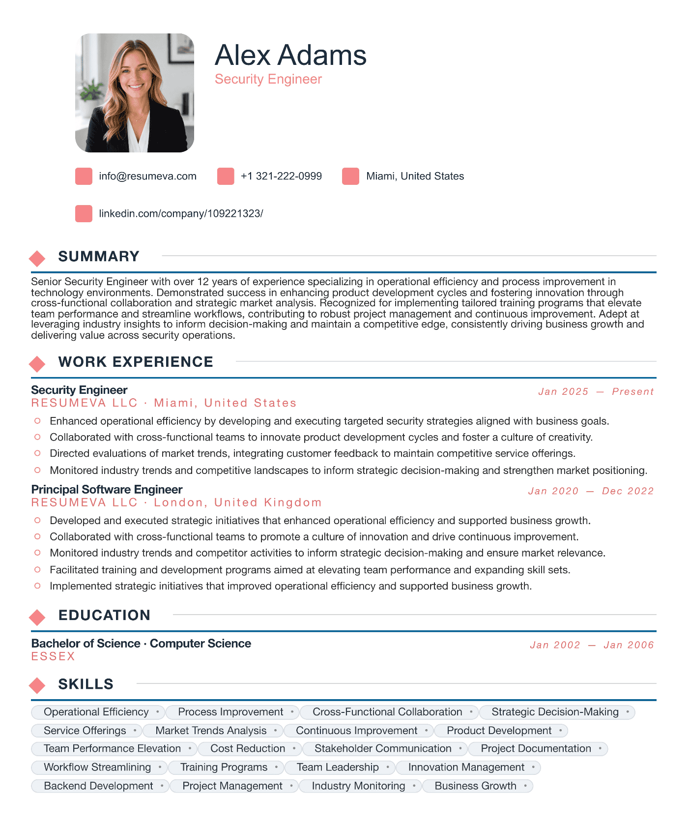
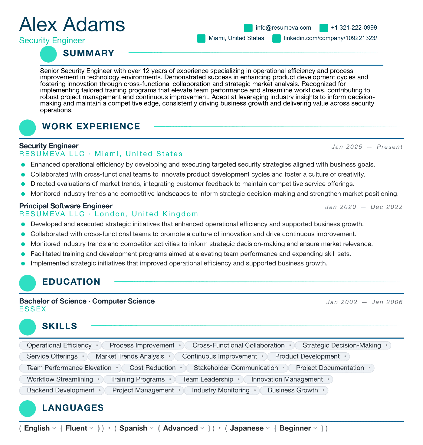
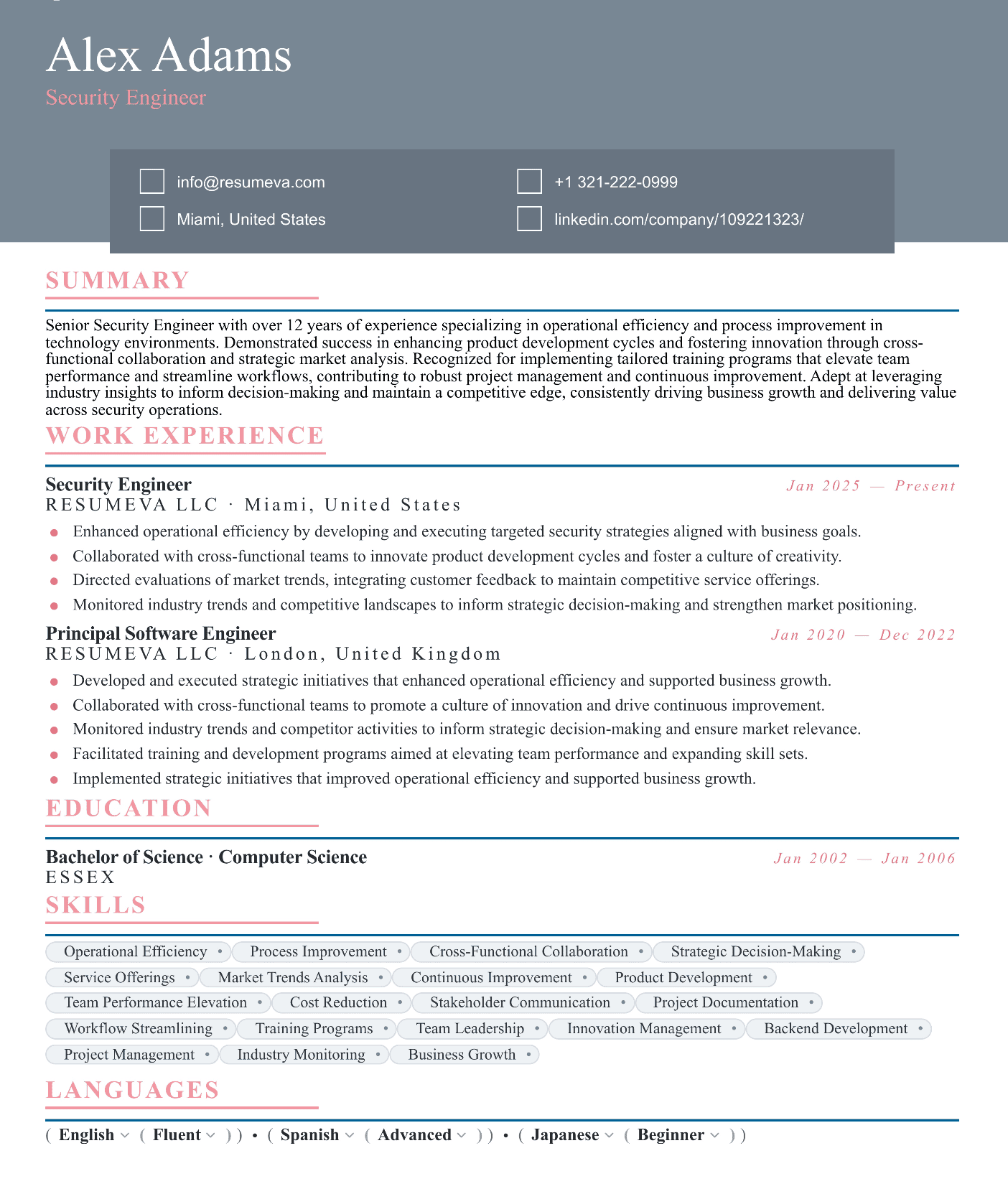
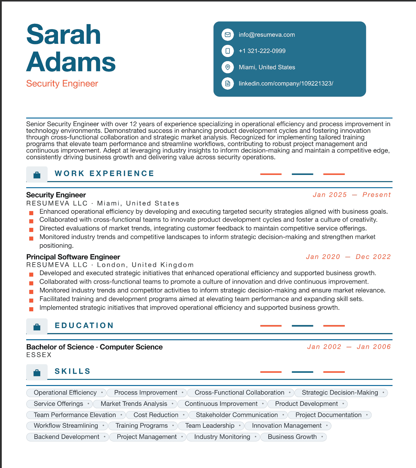
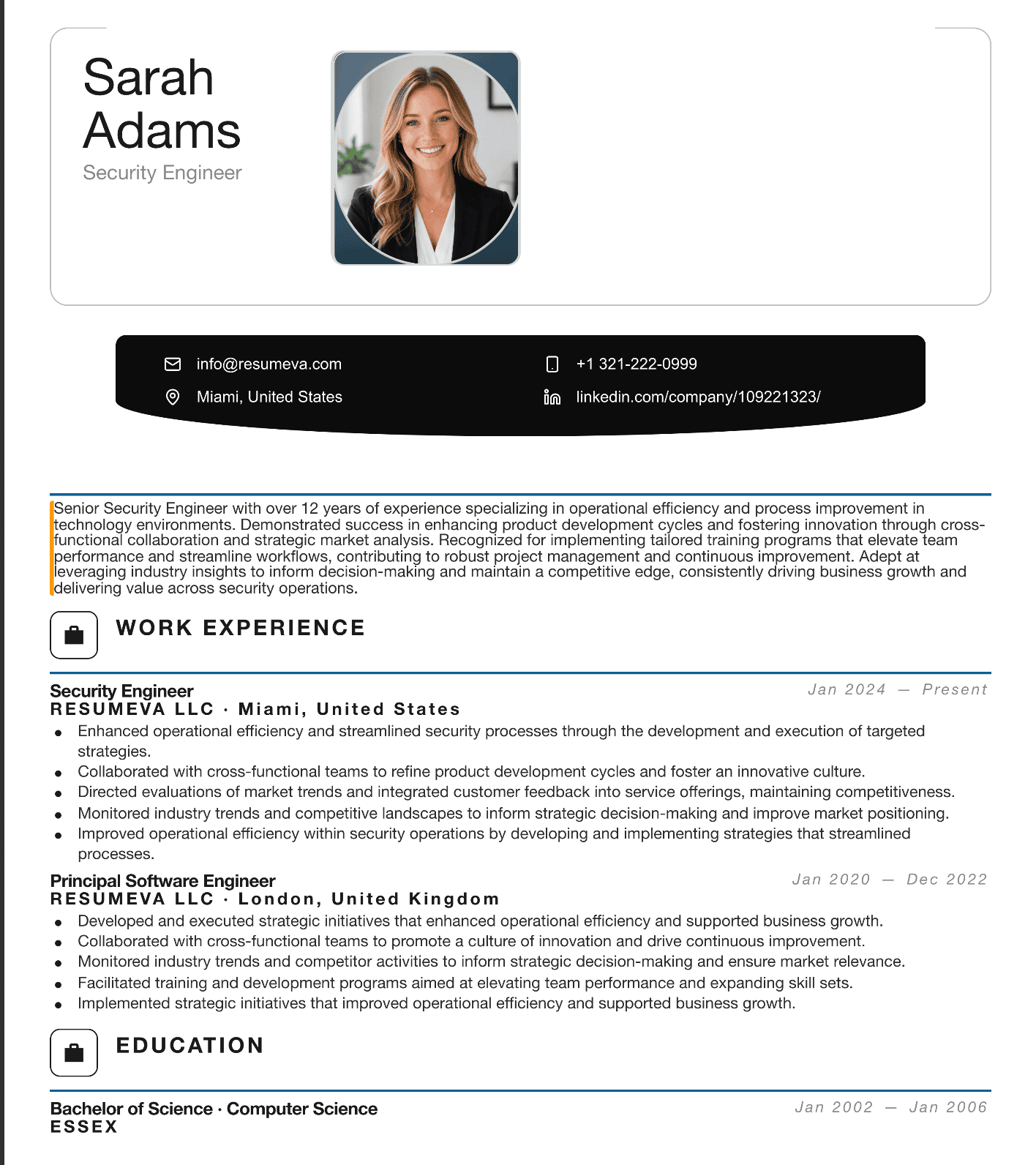
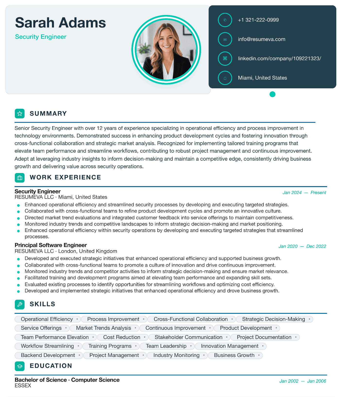
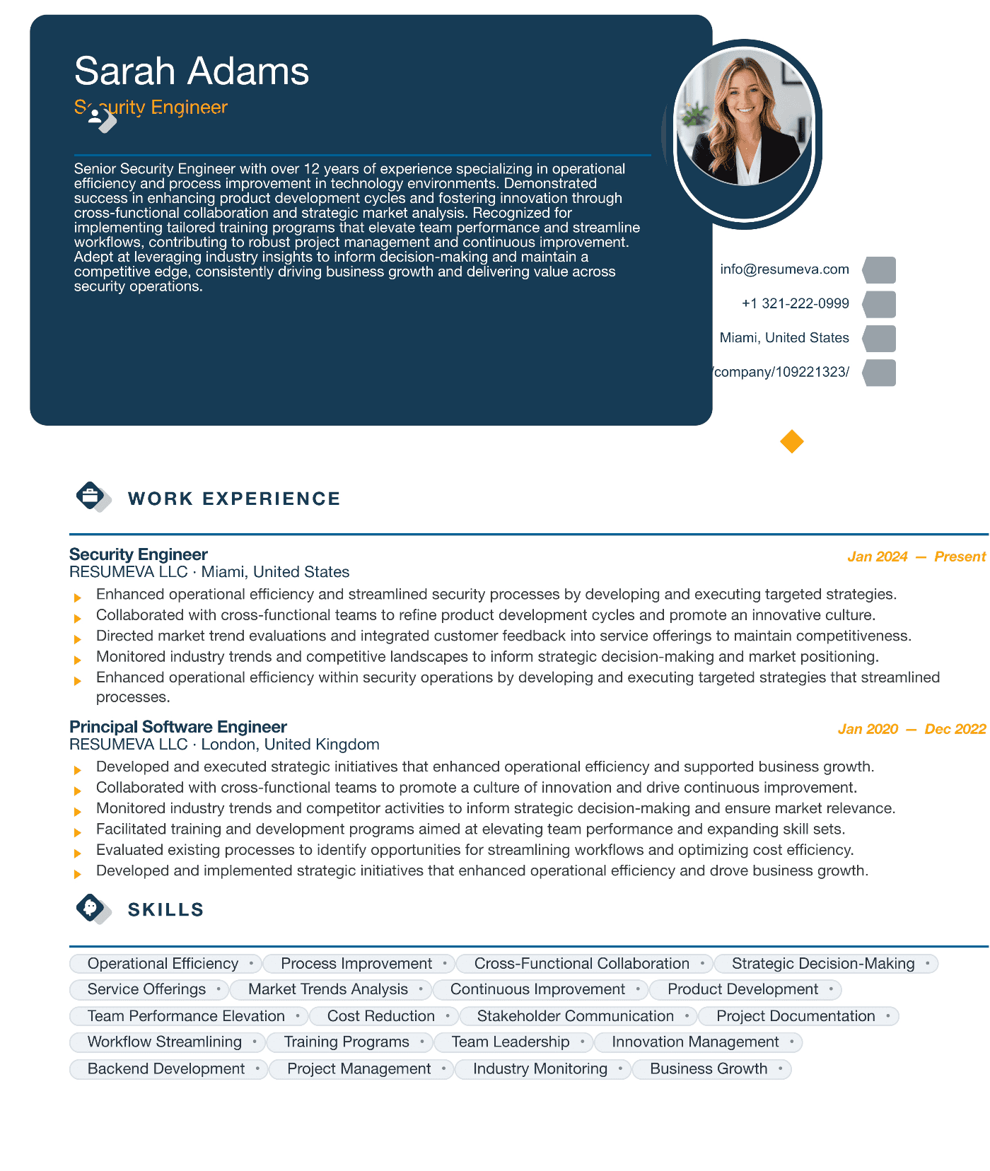
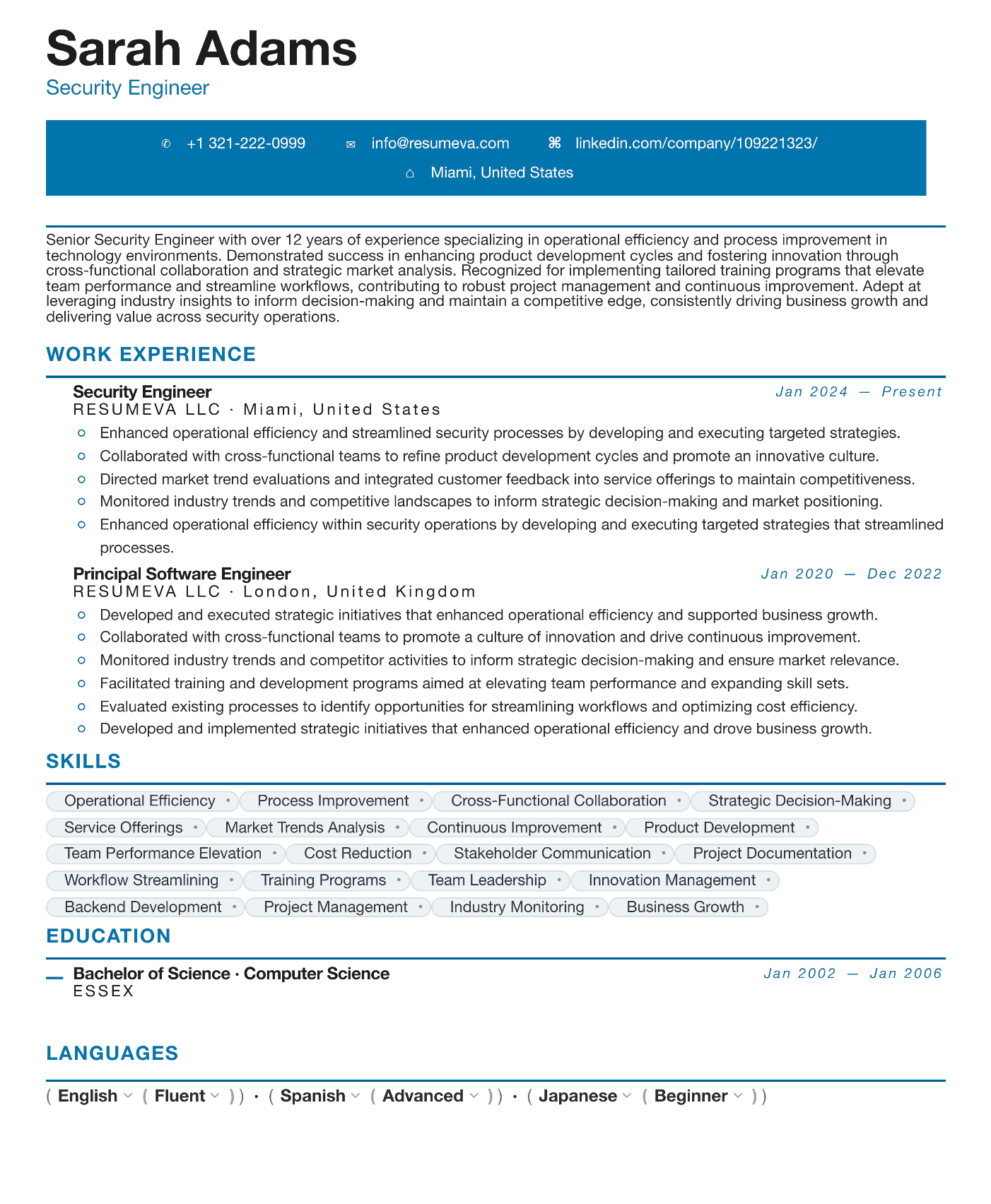
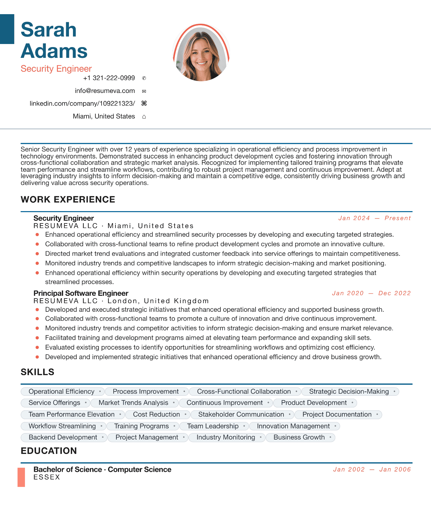
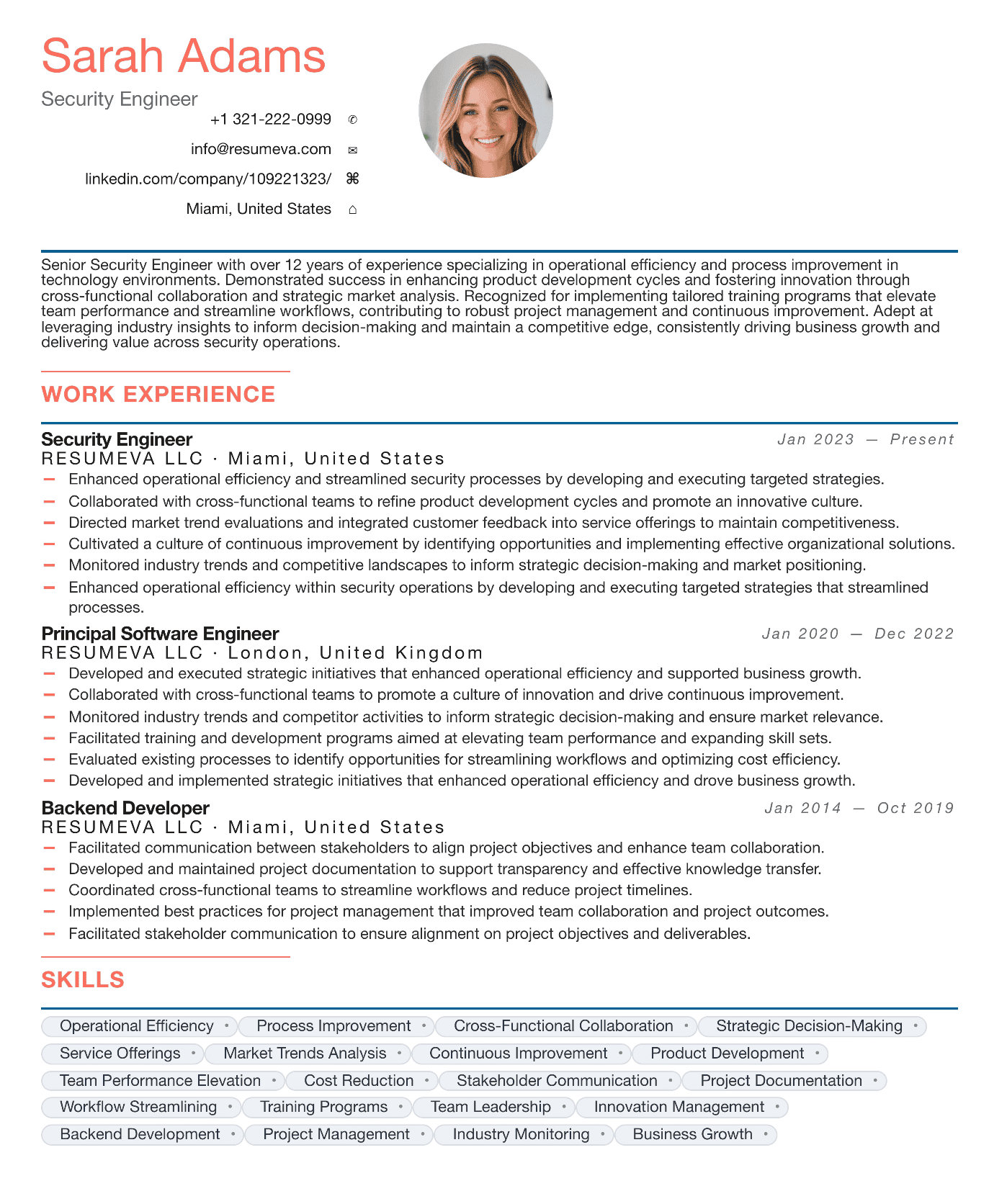
The myth: ATS-friendly means boring
Type ATS-friendly resume template into Google and you'll get a wall of identical, beige, single-column documents that look like they were typed in 1998. The implicit message is that any visual choice — color, type hierarchy, even a section border — risks killing your application. That message is wrong, and it costs job seekers interviews by making them produce resumes that look like every other resume in the stack.
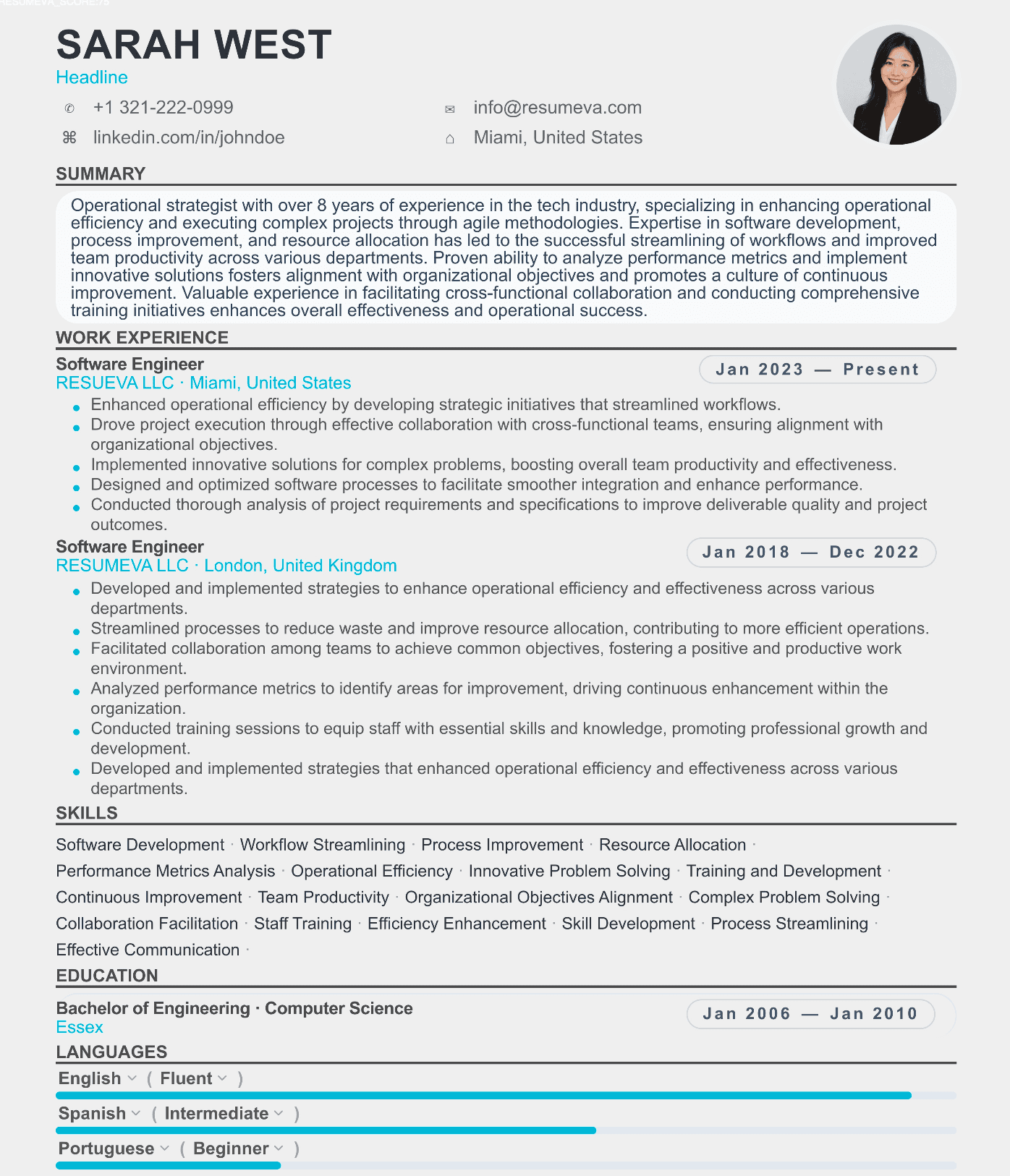
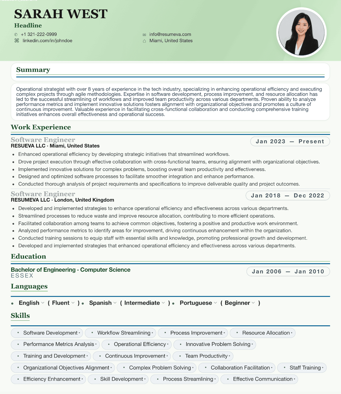
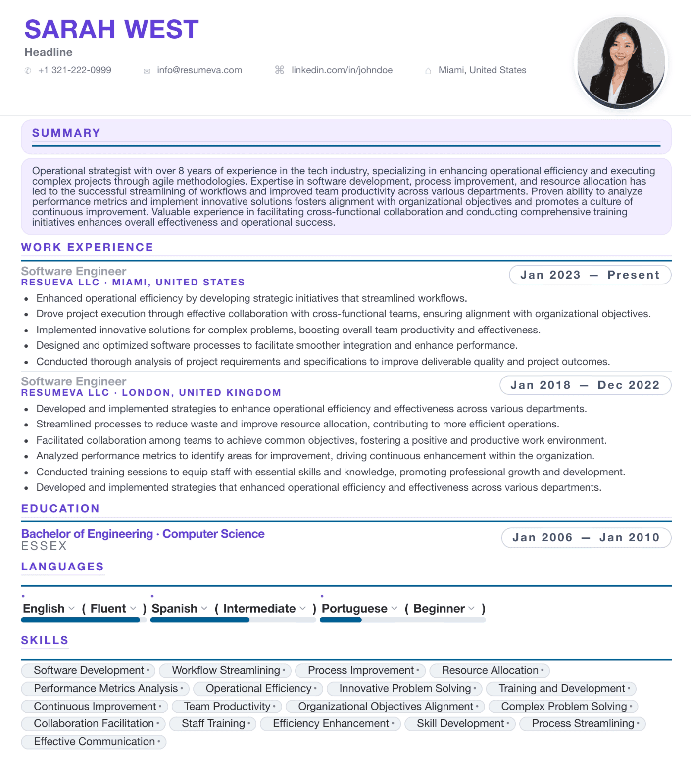
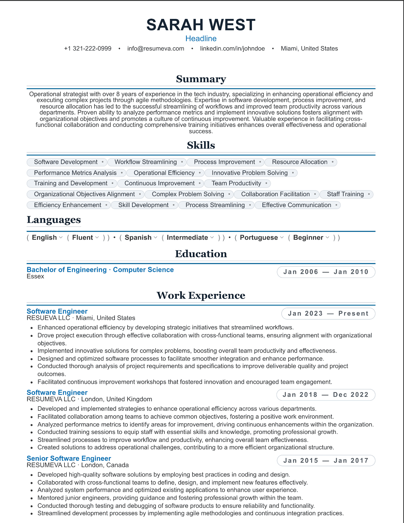
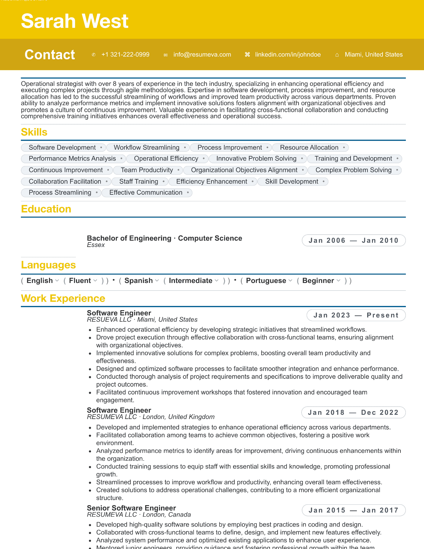
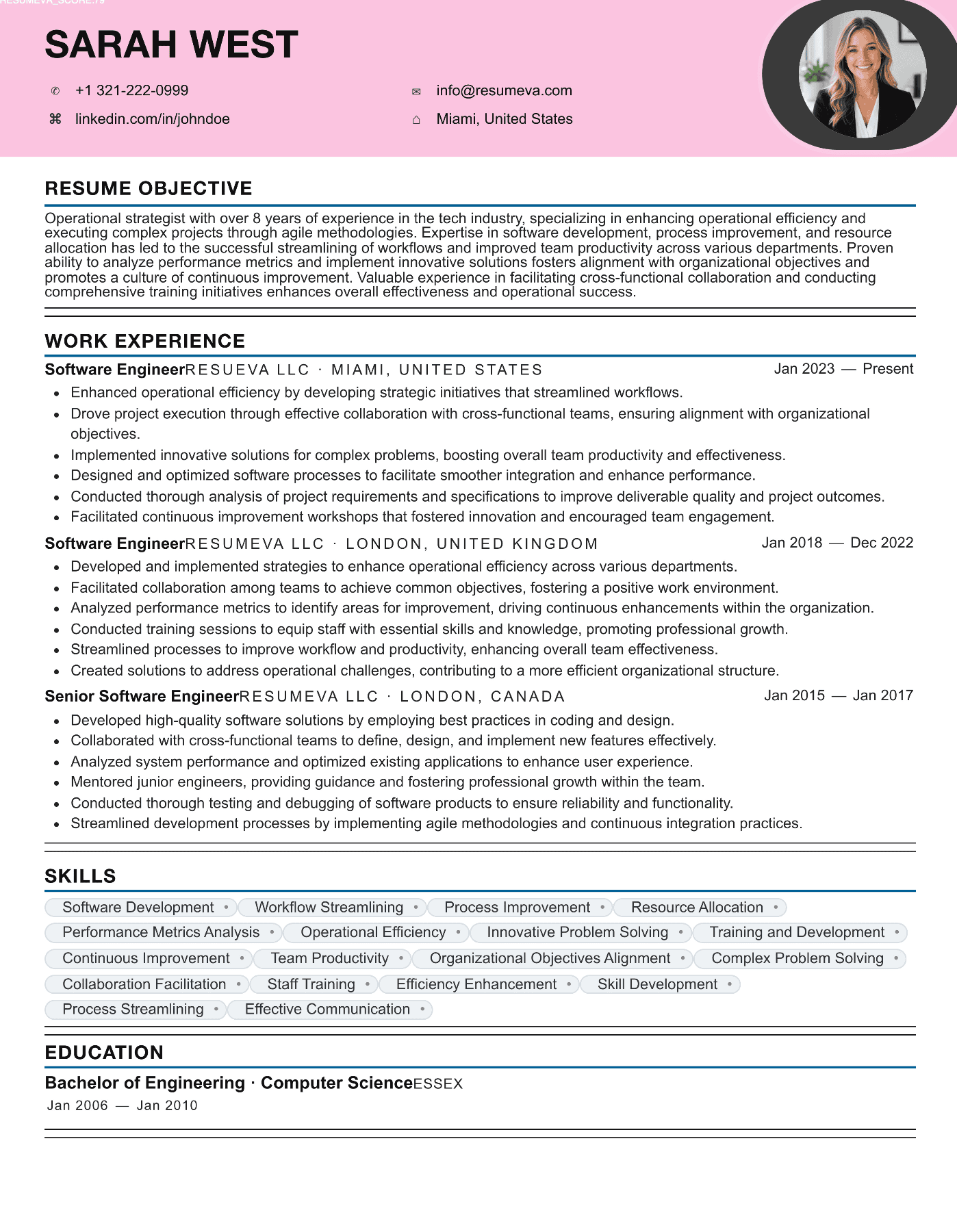
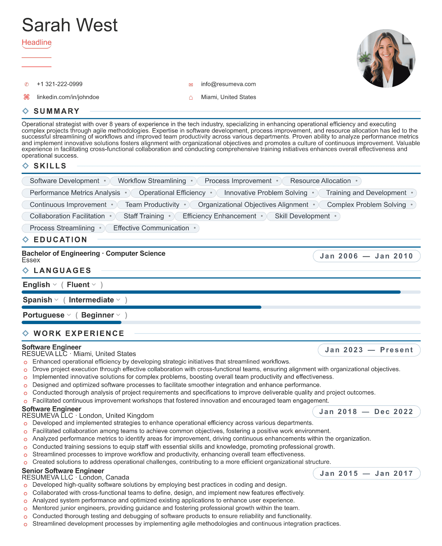
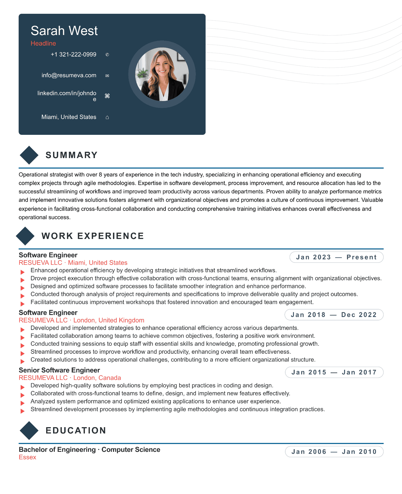
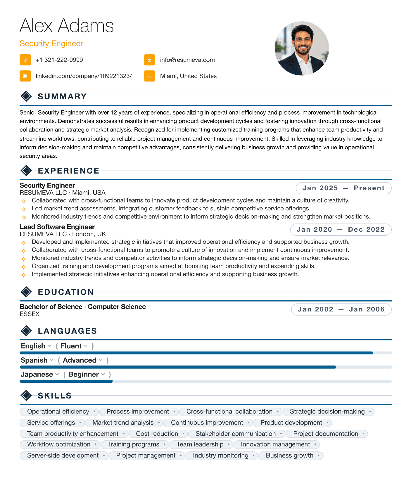
Modern ATS platforms — Greenhouse, Workday, Lever, iCIMS, Taleo, Ashby — are far more capable than their 2015 predecessors. They handle color. They handle bold and italic. They handle 1pt accent lines and tasteful section dividers. They handle two-page resumes. What they still struggle with is a small, specific set of structural choices that confuse the underlying parser.
The job of an ATS-friendly template is not to look plain. It's to avoid the structural mistakes that break parsing, while looking as polished as the company you want to work for.